Elevation
Elevation
高度
Elevation is the relative distance between two surfaces along the z-axis.
Elevationは、z軸に沿った2つの面の相対的な距離です。
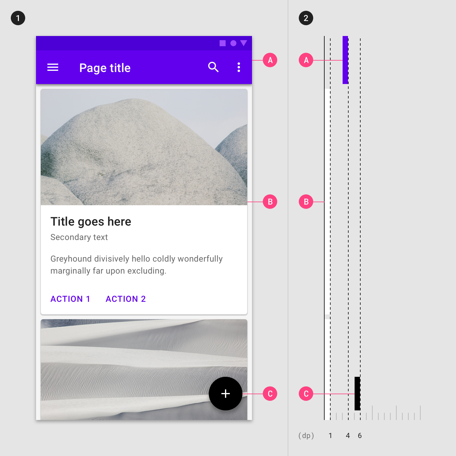
Component elevation values
- Nav drawer: 16dp
- App bar: 4dp
- Card: 1dp to 8dp
- FAB: 6dp
- Button: 2dp to 8dp
- Dialog: 24dp
Elevation in Material Design
マテリアルデザインの高度
Measuring elevation
高度の測定
Elevation in Material Design is measured as the distance between Material surfaces. The distance from the front of one Material surface to the front of...
Elevation in Material Design is measured as the distance between Material surfaces. The distance from the front of one Material surface to the front of another is measured along the z-axis in density-independent pixels (dps) and depicted (by default) using shadows
マテリアルデザインの高度は、マテリアルサーフェス間の距離として測定されます。 1つのマテリアルサーフェスの前面から別のマテリアルサーフェスの前面までの距離は、密度に依存しないピクセル(dps)ではz軸に沿って測定され、シャドウを使用して(デフォルトでは)示されます
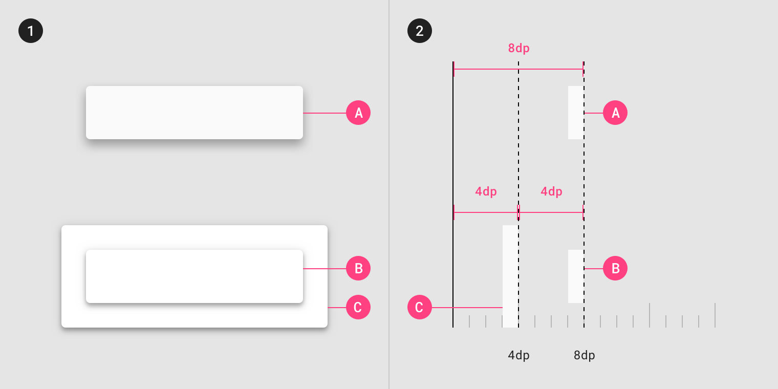
Surfaces at the same elevation can appear differently when other surfaces are behind them.
同じ高さのサーフェスは、他のサーフェスがその背後にあるときに、異なる表示をすることができます。
- Both surfaces A and B are at the same 8dp elevation. They cast different shadows because Surface B is in front of another surface (C) that already has elevation.
面AとBは同じ8dpの高さにあります。 表面Bは既に仰角を持っている別の表面(C)の前にあるので、それらは異なる影を投じる。 - Elevation differences between surfaces (A), (B), and (C), as viewed from the side.
側面から見た面(A)、(B)、(C)の高低差。
The elevation system
高度系
All Material Design surfaces, and components, have elevation values. Surfaces at different elevations do the following: Elevation can be depicted using shadows or other visual...
All Material Design surfaces, and components, have elevation values.
すべてのマテリアルデザインサーフェスとコンポーネントには高度値があります。
Surfaces at different elevations do the following:
異なる高度のサーフェスでは、次のことが行われます。
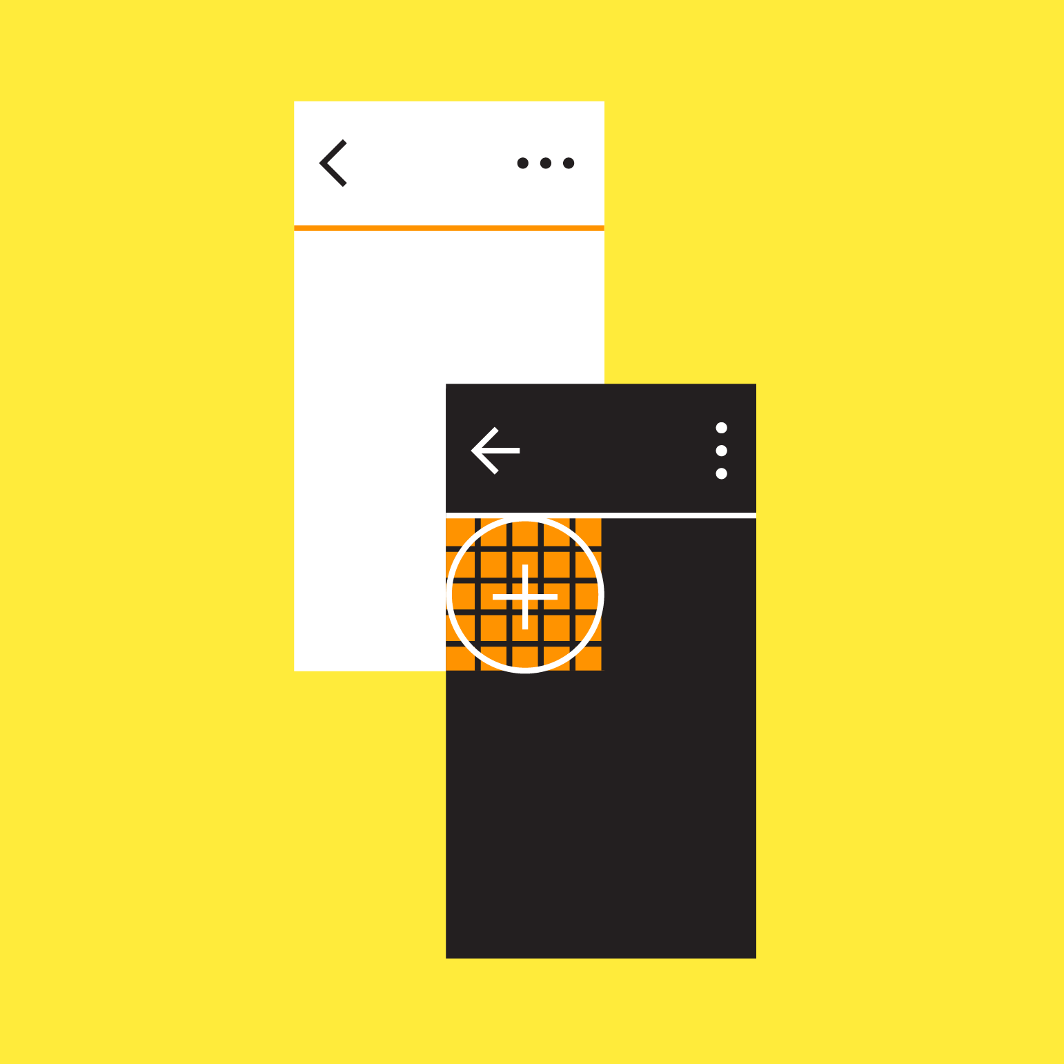
- Allow surfaces to move in front of and behind other surfaces, such as content scrolling behind app bars
アプリケーションバーの背後にあるコンテンツのスクロールなど、サーフェスを他のサーフェスの前後に移動させる - Reflect spatial relationships, such as how a floating action button’s shadow indicates it is separate from a card collection
フローティングアクションボタンの影が、そのボタンがカードコレクションとは別の階層にあることを示すなど、空間関係を反映 - Focus attention on the highest elevation, such as a dialog temporarily appearing in front of other surfaces
他のサーフェスの前に一時的に表示されるダイアログなど、最高の位置にあるオブジェクトに注意を集中させる
Elevation can be depicted using shadows or other visual cues, such as surface fills or opacities.
表面の塗りつぶしや不透明度などの影や他の視覚的な手がかりを使用して標高を描くことができます。

Material Design displays elevation using shadows.
マテリアルデザインは、影を使用して標高を表示します。
Caution.
Different surface fills can be used to express elevation instead of shadows.
異なる表面塗りつぶしを使用して、影の代わりに高度を表現することができます。
Caution.
Opacity can be used to express elevation instead of shadows.
不透明度は、影の代わりに高度を表現するために使用できます。
Resting elevation
静止時高度
Resting elevations are starting elevation values given to components by default. Components move from resting elevations in response to the user or a system event....
Resting elevations are starting elevation values given to components by default. Components move from resting elevations in response to the user or a system event. All Material components have resting elevations that are the same for each type of component. For example, all cards have the same resting elevations as each other, and a dialog has the same resting elevation as other dialogs.
静止時高度は、デフォルトでコンポーネントに与えられた初期高度値です。 コンポーネントは、ユーザーまたはシステムイベントに応答して静止時高度から移動します。 すべてのマテリアルコンポーネントは、各コンポーネントタイプごとに同じ静止時高度を持ちます。 例えば、すべてのカードは同じ静止時高度を持ち、ダイアログは他のダイアログと同じ高度を持ちます。
Resting elevation and environment
静止時高度と環境
Resting elevations vary based on the environment, platform, or app. The resting elevations on mobile are designed to provide visual cues, like shadows, to indicate when components are interactive. In contrast, resting elevations on desktop are shallower because other cues, like hover states, communicate when a component is interactive. For example, cards at 0dp elevation on desktop are outlined with a stroke.
静止時高度は、環境、プラットフォーム、またはアプリによって異なります。 モバイル上の静止時高度は、コンポーネントがインタラクティブであることを示すために影などの視覚的手がかりを提供するように設計されています。 対照的に、ホバー状態のような他の手がかりは、コンポーネントがインタラクティブであることを示すので、デスクトップ上の静止時高度は浅くなります。 たとえば、デスクトップの0dpの高さにあるカードは、ストロークで輪郭が描かれます。
- Resting elevations on mobile for an app bar (A), cards (B), and a floating action button (C), as viewed from the front
正面から見たアプリケーションバー(A)、カード(B)、フローティングアクションボタン(C)のモバイルでの標高の上昇 - The same components, as viewed from the side
側面から見た同じコンポーネント
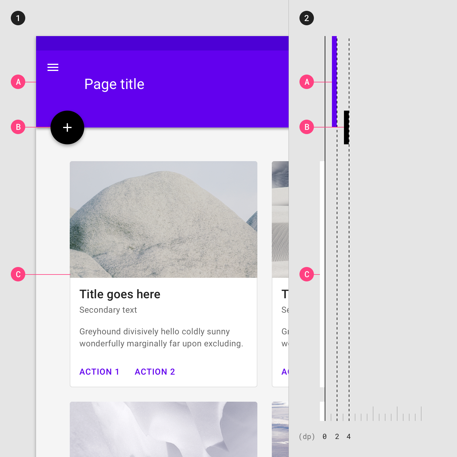
- Resting elevations on desktop for an app bar (A), floating action button (B), and cards (C), as viewed from the front
アプリバー(A)、フローティングアクションボタン(B)、およびカード(C)のデスクトップ上の正面から見た仰角の静止 - The same components, as viewed from the side
側面から見た同じコンポーネント
Changing elevation
高度の入れ替え
Components can change elevation in response to user input or system events. When this happens, components move to preset dynamic elevation offsets, which are the...
Components can change elevation in response to user input or system events. When this happens, components move to preset dynamic elevation offsets, which are the default elevations components move to when not resting.
コンポーネントは、ユーザ入力またはシステムイベントに応じて標高を変更することができます。 この場合、コンポーネントは、既定の高度のコンポーネントが動いている時に使用される、あらかじめ設定された動的な高度のオフセット(余白?)に移動します。
Dynamic elevation offsets are the same across each type of component. For example, all cards use the same offset as other cards, and all floating action buttons use the same offset as other floating action buttons.
動的な高度オフセットは、各タイプのコンポーネントで共通です。 たとえば、すべてのカードは他のカードと同じオフセットを使用し、すべての浮動アクションボタンは他の浮動アクションボタンと同じオフセットを使用します。
Once the user input (or system event) is completed or cancelled, the component swiftly returns to its resting elevation.
ユーザ入力(またはシステムイベント)が完了またはキャンセルされると、コンポーネントは安静時の高度に迅速に戻ります。
Some components respond to user input with increases in elevation.
一部のコンポーネントは、ユーザ入力に応答して仰角の増加に対応します。
- Upon user input, this button increases its elevation from 2dp to 8dp
ユーザの入力時に、このボタンは2dpから8dpに上昇します - The same component, as viewed from the side
側面から見た同じコンポーネント
Elevation interference
高度の干渉
When a component moves between its resting elevation and dynamic elevation offset, it shouldn’t collide with other components. To avoid these kinds of collisions, components...
When a component moves between its resting elevation and dynamic elevation offset, it shouldn’t collide with other components.
コンポーネントが静止高度と動的高度オフセットの間を移動するとき、コンポーネントは他のコンポーネントと衝突してはなりません。
To avoid these kinds of collisions, components can move out of the way. For example, if increasing a card’s elevation positions it to pass through a floating action button, that button can disappear or move off-screen before the collision occurs.
これらの種類の衝突を避けるために、コンポーネントは途中で移動できます。 たとえば、カードの高さを上げて浮動アクションボタンを通過すると、そのボタンは、衝突が発生する前に消えたり画面外に移動したりできます。
You can also design your app’s layout to avoid collisions, such as placing a floating action button beside cards, instead of directly above them.
アプリのレイアウトを設計して、カードのすぐ上ではなく、カードの横に浮動アクションボタンを配置するなど、衝突を避けることもできます。
Temporarily reposition or remove components which might collide with transitioning components. Front (1) and side (2) views of a card stream on a mobile device, demonstrating how a floating action button (B) disappears when a card (A) is picked up.
移行中のコンポーネントと衝突する可能性のあるコンポーネントを一時的に再配置または削除します。 カード(A)がピックアップされたときにフローティングアクションボタン(B)が消える様子を示す、モバイルデバイス上のカードストリームの前面(1)と側面(2)
Design your app to minimize opportunities for elevation-based interference.
エレベーションベースの干渉の可能性を最小限に抑えるようにアプリケーションを設計します。
Depicting elevation
高度の表現
To successfully depict elevation, a surface must show:
高度を正しく描写するために、サーフェスは以下を表示する:
- Surface edges, contrasting the surface from its surroundings
表面と周囲とのコントラスト - Overlap with other surfaces, either at rest or in motion
他の表面との重なり、(静止時、動作中問わず) - Distance from other surfaces
他の面からの距離
Edges help to express the tactile quality of Material surfaces. They show where one surface ends and another begins by separating different parts of a...
Edges help to express the tactile quality of Material surfaces. They show where one surface ends and another begins by separating different parts of a UI into identifiable components. For example, the edges of an app bar show that it is separate from a grid list, communicating to the user that the grid list scrolls independently of the app bar.
エッジは、マテリアルサーフェスの触覚品質を表現するのに役立ちます。 UIの異なる部分を識別可能なコンポーネントに分割することで、一方のサーフェスがどこで終わり、もう一方のサーフェスがどこから始まるかを示します。 たとえば、アプリバーの端にグリッドリストとは別のものが表示され、グリッドリストがアプリバーとは独立してスクロールすることをユーザーに伝えます。
By default, Material surfaces use shadows to indicate edges. Other methods can be used to indicate edges, such as:
デフォルトでは、マテリアルサーフェスはエッジを示すためにシャドウを使用します。 他の方法を使用して、エッジを示すことができます。
- Giving surfaces different colors
サーフェスの色を変える - Giving surfaces different opacities
表面に異なる不透明度を与える
Edges must create sufficient contrast between surfaces (by meeting or exceeding accessible contrast ratios) for them to be seen as separate from one another.
エッジは、互いに分離して見えるように、(アクセス可能なコントラスト比を満たすか、またはそれ以上の)十分なコントラストを作成する必要があります。
Without showing edges, it’s unclear if this image contains one or more surfaces.
エッジを表示せずに、この画像に1つ以上のサーフェスが含まれているかどうかは不明です。

When a surface overlaps another surface, either partially or completely, it indicates that the two surfaces occupy different elevations (but not the degree, or amount,...
When a surface overlaps another surface, either partially or completely, it indicates that the two surfaces occupy different elevations (but not the degree, or amount, of difference between them). Surfaces at higher elevations appear in front of those at lower elevations, meaning they are positioned at different elevations along the z-axis. Surfaces may overlap one another by default, or become overlapped as a result of motion that changes their position in the UI.
サーフェスが部分的にまたは完全に別のサーフェスと重なっている場合、2つのサーフェスは異なる高度に存在することをを意味します(サーフェス間の高度差異の量を示すものではありません)。 より高い標高の表面は、標高の低い標高の前面に現れます。つまり、Z軸に沿って異なる標高に位置しています。 サーフェスは、デフォルトで互いに重なり合ったり、UIの位置を変更するモーションの結果として重なったりすることがあります。
When surfaces have different opacities or insufficient contrast from one another, it can make it difficult to tell which surface is in front of another. Avoid ambiguous overlap by ensuring surface edges are clearly defined.
サーフェスが異なる不透明度を持つ、または互いにコントラストが不十分な場合は、どちらのサーフェスが別のサーフェスの前にあるかを知ることが難しくなります。 サーフェスの淵を明確にすることで、あいまいなオーバーラップは避けてください。

- Shadows show surface edges, surface overlap, and the degree of elevation.
影は、サーフェスエッジ、サーフェスオーバーラップ、および高度の度合いを示します。 - Different surface colors show surface edges and overlap, but not the degree of elevation.
異なる表面色は表面のエッジと重なりを示しますが、高さの程度は示されません。 - Opacity shows surface edges and overlap, but not the degree of elevation.
不透明度はサーフェスエッジとオーバーラップを示しますが、高さの度合いは示していません。

Do.
The top app bar overlaps the cards, indicating it is in front of the cards. This overlap doesn’t express the degree of elevation between the surfaces.
一番上のアプリバーがカードの上に重なり、カードの前にあることを示します。 このオーバーラップは、表面間の高さの程度を表していません。

Distance
距離
The degree of elevation difference between surfaces can be expressed using scrimmed backgrounds, or using shadows.
The degree of elevation difference between surfaces can be expressed using scrimmed backgrounds, or using shadows.
サーフェス間の高低差の度合いは、スクリメージをかけた背景やシャドウを使用して表現できます。
Scrimmed backgrounds
スクライドされた背景
When the background is scrimmed in a UI, it expresses that the content above it is at a higher elevation. Scrimmed backgrounds express large, but unspecified, amounts of elevation.
背景がUIでスクライミングされると、その上のコンテンツがより高い高度にあることが表現されます。 スクライドされた背景が描かれた背景は、不特定ながら大きく高度が異なることを表現します。

Do.
A scrimmed background can indicate surface overlap, but not the degree of elevation.

Don’t.
The lack of shadows or scrimmed background makes it difficult to distinguish the dialog box from the background.
影がないかスクリムをしていないと、ダイアログボックスを背景と区別することが難しくなります。
Shadows
影
Shadows can express the degree of elevation between surfaces in ways that other techniques cannot.
影は他のテクニックではできない方法で表面間の高度を表現することができます。
Both a shadow’s size and amount of softness or diffusion express the degree of distance between two surfaces. For example, a surface with a shadow that is small and sharp indicates a surface’s close proximity to the surface behind it. Larger, softer shadows express more distance.
影の大きさと柔らかさまたは拡散量の両方は、2つの面の間の距離の程度を表します。 たとえば、シャドウが小さくシャープであるサーフェスは、サーフェスがサーフェスの後ろのサーフェスに近接していることを示します。 より大きく、より柔らかい影は、より多くの距離を表現します。
Subtle differences in shadow size and diffusion communicate:
影の大きさと拡散の微妙な違いが伝える:
- A detailed degree of distance between two surfaces
2つのサーフェス間の詳細な距離 - Elevation differences between non-overlapping surfaces
オーバーラップしていないサーフェス間の標高差

Shadows show the edges of a surface and its degree of elevation against the background. They also make differences in surface elevations perceptible between non-overlapping surfaces.
影は、サーフェスのエッジと、そのサーフェスの高度を背景に対して表示します。 それらはまた、重なり合わないサーフィスの間で知覚可能なサーフィスの高低差を生じさせます。

Do.
Shadows make differences in surface elevation perceptible. The smaller, sharper shadow of the app bar (1) indicates it is at a lower elevation than the menu (2), which has a larger, softer shadow.
陰影は表面の高さを知覚可能にする。 アプリケーションバー(1)の小さくシャープな影は、より大きくて柔らかい影を持つメニュー(2)よりも低い高度にあることを示します。

Don’t.
The lack of shadows or other visual cues to indicate edges and surface overlap creates insufficient contrast between surfaces. As a result, it’s difficult to understand which pieces of this UI are grouped together.
エッジやサーフェスの重なりを示すシャドーや他の視覚的な手がかりがないと、サーフェス間のコントラストが不十分になります。 その結果、このUIのどの部分がグループ化されているのかを理解することは困難です。

Don’t.
Don’t use shadows for style only.
単なる装飾として影を使用しないでください。
Motion and elevation
動きと高度
Motion can emphasize elevation using the following methods: Changes in shadow size and softness emphasize changes in elevation. A surface may overlap another upon animation,...
Motion can emphasize elevation using the following methods:
動きは、以下の方法を使用して標高を強調できます。
- Changes in shadows
影の変化 - Displaying overlap
オーバーラップを表示する - Pushing
押し出す - Scaling
拡大縮小 - Parallax
パララックス
Changes in shadows
影の変化
Changes in shadow size and softness emphasize changes in elevation.
影の大きさや柔らかさの変化は標高の変化を強調します。
The shadow grows to emphasize the card is rising.
カードが上がっていることを強調するために影が広がります。
Displaying overlap
オーバーラップを表示する
A surface may overlap another upon animation, either partially or completely, showing which surface is in front of the other.
サーフェスは、部分的にまたは完全に、アニメーションの際に別のサーフェスが重なり、どちらのサーフェスが他のサーフェスの前にあるかを示します。
As it expands, a surface may show elevation by overlapping nearby surfaces.
拡大すると、サーフェスは近くのサーフェスをオーバーラップさせて仰角を表示することがあります。
Parallax
パララックス
Multiple surfaces at different elevations that move at different speeds can create a sense of depth and place focus on foreground content.
異なる標高で複数のサーフェスが異なる速度で移動すると、深さの感覚が形成され、フォアグラウンドのコンテンツにフォーカスが置かれます。
The foreground surface moves faster than the background image, creating a sense of depth.
前景の表面は背景のイメージよりも速く動いて、深みの感覚を作り出します。
Combining motion techniques
モーション技術の組み合わせ
Elevation can be emphasized through a combination of motion techniques.
高度は、モーション技術の組み合わせによって強調することができます。
Parallax motion and scaling emphasize which surfaces are in front of others.
視差の動きとスケーリングは、どのサーフェスが他のサーフェスの前にあるかを強調します。
Elevation hierarchy
高度階層
Content relates to other content depending on whether they are at similar or different elevations.
コンテンツは、類似しているか異なる高度にあるかに応じて、他のコンテンツに関連します。
Content at different elevations
異なる高度のコンテンツ
Surfaces in front of other surfaces typically:
Surfaces in front of other surfaces typically:
- Contain more important content
より重要なコンテンツを含む - Focus attention, such as a dialog
ダイアログなどの注目を集める - Control the surfaces behind it, such as actions in an app bar
アプリケーションバーのアクションなど、その背後にあるサーフェスを制御する

Front (1) and side (2) views of a desktop interface demonstrate how more important content that is of primary focus (B) appears in front of content that is of secondary focus, like footnotes (A).
デスクトップインターフェイスのフロント(1)とサイド(2)ビューは、プライマリフォーカス(B)の重要なコンテンツが、脚注(A)のようにセカンダリフォーカスのコンテンツの前に表示される方法を示します。
Content on coplanar surfaces
同一平面上のコンテンツ
Positioning surfaces at the same elevation makes them coplanar, and may indicate they contain content of equal importance as one another. For example, all cards...
Positioning surfaces at the same elevation makes them coplanar, and may indicate they contain content of equal importance as one another. For example, all cards in a collection have equal importance.
同じ高さにサーフェスを配置すると、サーフェスが同一平面になり、互いに同等の重要性をもった内容が含まれていることを示せます。 たとえば、コレクション内のすべてのカードの重要度は同じです。
- Cards (A, B), as viewed from the front, have the same elevation and move together, reinforcing that their content has similar hierarchy
正面から見たカード(A、B)は同じ仰角を持ち、一緒に動いて内容が類似していることを補強します - The same components, as viewed from the side
側面から見た同じコンポーネント
Surfaces that don’t express elevation can appear coplanar. For surfaces that don’t express elevation, you can communicate hierarchy differences through their content and by adjusting their horizontal and vertical layout position to suggest their relative hierarchy levels.
高度を持たないサーフェスは同一平面上に表示されます。 高度を持たないサーフェスの場合は、コンテンツの階層的な違いを伝えるために、相対的な階層レベルを示唆するように水平と垂直のレイアウト位置を調整することができます。
For example, on a dashboard with coplanar surfaces, detail content is placed next to parent content, based on the direction a language’s text is displayed.

- A desktop UI, as viewed from the front, demonstrates how the left-to-right positioning of surfaces at the same elevation (A, B, C) communicates hierarchy based on English language content.
正面から見たデスクトップUIは、同じ高度(A、B、C)での左から右へのサーフェスの配置が英語のコンテンツに基づいて階層をどのように伝達するかを示しています。(左上から右下へと読み進めることを「English language content」と言っている?) - The same components, as viewed from the side
側面から見た同じコンポーネント
Default elevations
デフォルトの高さ
All elements have default values for resting elevation and dynamic elevation offsets. Certain components are positioned at higher elevations than others, establishing a consistent elevation order across all components. For example, dialogs always appear in front of all other components.
すべての要素には、静止高度と動的高度のオフセットのデフォルト値があります。 特定のコンポーネントは、他のコンポーネントよりも高い高度に配置され、すべてのコンポーネントにわたって一貫した昇順を確立します。 たとえば、ダイアログは常に他のすべてのコンポーネントの前に表示されます。
The following table lists default values for resting elevation and dynamic elevation offsets.
次の表に、静止高度と動的仰角オフセットのデフォルト値を示します。
Table of default elevation values
Component Default elevation values (dp) Dialog 24 Modal bottom sheet Modal side sheet 16 Navigation drawer 16 Floating action button (FAB - pressed) 12 Standard...
|
Component |
Default elevation values (dp) |
|
Dialog |
24 |
|
Modal bottom sheet Modal side sheet |
16 |
|
Navigation drawer |
16 |
|
Floating action button (FAB - pressed) |
12 |
|
Standard bottom sheet Standard side sheet |
8 |
|
Bottom navigation bar |
8 |
|
Bottom app bar |
8 |
|
Menus and sub menus |
8 |
|
Card (when picked up) |
8 |
|
Contained button (pressed state) |
8 |
|
Floating action button (FAB - resting elevation) |
6 |
|
Top app bar (scrolled state) |
4 |
|
Top app bar (resting elevation) |
0 or 4 |
|
Refresh indicator |
3 |
|
Contained button (resting elevation) |
2 |
|
Search bar (resting elevation) |
1 |
|
Card (resting elevation) |
1 |
|
Switch |
1 |
|
Text button |
0 |
|
Standard side sheet |
0 |
Diagram of default elevation values
デフォルトの高度値の図
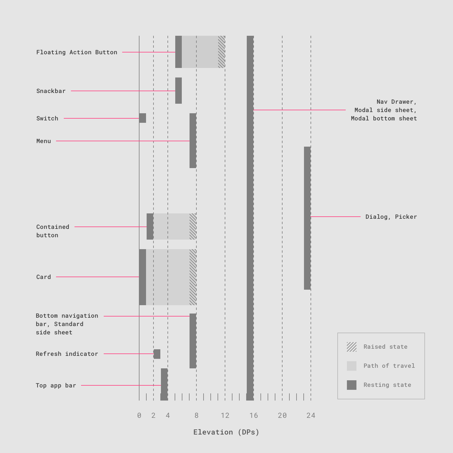
Cross-section diagram showing the resting elevation and dynamic elevation offsets for multiple components.
複数のコンポーネントの静止高度と動的高度のオフセットを示す断面図。
Surfaces
Surfaces
サーフィス
Material Design has three-dimensional qualities that are
reflected in its use of surfaces, depth, and shadows.
マテリアルデザインは3次元的な表現を備えていて、それらは表面、深さ、影の使用に反映されています。
Material environment
マテリアルエンバイロメント
The physical world
物理的な世界
In the physical world, objects can be stacked or attached to one another, but cannot pass through each other. They cast shadows and reflect light....
In the physical world, objects can be stacked or attached to one another, but cannot pass through each other. They cast shadows and reflect light.
物理的な世界では、オブジェクトは積み重ねられたり、互いに結合されたりすることはありますが、互いに通過することはできません。 彼らは影を落とし、光を反射します。
Material Design reflects these qualities in how surfaces are displayed and move across the Material UI. Surfaces, and how they move in three dimensions, are communicated in ways that resemble how they move in the physical world. This spatial model can also be applied consistently across apps.
マテリアルデザインは、サーフェスがどのように表示され、マテリアルUI内を移動するかというこれらの品質に反映されます。 サーフェスと3次元での移動方法は、物理的な世界でどのように動くかに似ています。 この空間モデルは、アプリ全体で一貫して適用することもできます。
Depth
深さ
Material Design UIs are displayed in an environment that expresses three-dimensional (3D) space using light, surfaces, and cast shadows. All elements in the Material environment...
Material Design UIs are displayed in an environment that expresses three-dimensional (3D) space using light, surfaces, and cast shadows. All elements in the Material environment move horizontally, vertically, and at varying depths along the z-axis. Depth is depicted by placing elements at various points along the positive z-axis extending towards the viewer.
マテリアルデザインUIは、光、サーフェス、影を使用して3次元(3D)スペースを表現する環境に表示されます。 マテリアル環境のすべての要素は、水平方向、垂直方向、およびz軸に沿ったさまざまな深度に移動します。 深さは、観察者に向かって延びる正のz軸に沿った様々な点に要素を配置することによって表現されます。
On the web, the UI expresses 3D space by manipulating the y-axis.
ウェブ上では、UIはy軸を操作して3D空間を表現します。

3D space with x, y, and z axes
Properties
プロパティ
Material surfaces have consistent, unchangeable characteristics and behaviors across Material Design.
マテリアルサーフェスは、マテリアルデザイン全体で一貫性のある変更不可能な特性と動作を持ちます。
Dimensions
次元
Material has varying x & y dimensions (measured in dp) and a uniform thickness (1dp).
Material has varying x & y dimensions (measured in dp) and a uniform thickness (1dp).
マテリアルはx、yの寸法(dpで測定)と均一な厚み(1dp)で変化します。

Do.
The height and width of material can vary.

Don’t.
Material is always 1dp thick.
Shadows
影
Material surfaces at different elevations cast shadows.
Material surfaces at different elevations cast shadows.
異なる標高の材料表面は影を投げかけます。
Do.
Shadows show the elevation of different Material surfaces.
陰影は、異なるMaterialサーフェスの高さを示します。
- Top view
トップビュー - Isometric 3D view showing the shadow cast by light when the material moves upwards
マテリアルが上に移動したときの光の影を示すアイソメトリック3Dビュー
Resolution
解像度
Material has infinite resolution.
Material has infinite resolution.
マテリアルには無限の分解能があります。
Material has infinite resolution.
材料には無限の分解能があります。
Content
コンテンツ
Content is displayed in any shape and color on Material. Content does not add thickness to Material. Content is expressed without being a separate layer.
Content is displayed in any shape and color on Material. Content does not add thickness to Material. Content is expressed without being a separate layer.
コンテンツは、任意の形や色で素材に表示されます。 内容は材料に厚さを加えません。 コンテンツは別の同一レイヤー内で表現されます。
Do.
Material can display any shape and color. Content can behave independent of Material, but is limited within the bounds of Material.
マテリアルは任意の形や色を表示できます。 コンテンツはマテリアルから独立して動作できますが、マテリアルの境界内では制限されます。
Do.
Content behavior can depend on Material behavior.
コンテンツの動作はマテリアルの動作に依存しうる
Physical properties
物理プロパティ
Material is solid. User input and interaction cannot pass through material. Multiple Material elements cannot occupy the same point in space simultaneously. Material cannot pass...
Material is solid. User input and interaction cannot pass through material.
マテリアルは固体です。 ユーザーの入力とインタラクションはマテリアルを通過できません。

Do.
Input events only affect the surface of Material.
入力イベントはマテリアルの表面にのみ影響します。

Don’t.
Input events cannot pass through Material.
入力イベントはマテリアルを通過できません。
Multiple Material elements cannot occupy the same point in space simultaneously.

Do.
Prevent multiple Material elements from simultaneously occupying the same point in space, such as by separating elements with elevation.
エレベーションで要素を区切るなど、複数のマテリアル要素が同時に空間内の同じ点を占めることを防ぎます。

Don’t.
Multiple Material elements cannot occupy the same point in space simultaneously.
複数のマテリアル要素は、同時に空間内の同じ点を占めることはできません。
Material does not behave like a gas.
材料はガスのように振る舞いません。
Don’t.
Material does not behave like a gas.
マテリアルはガスのように振る舞いません。
Do.
Material enters and exits through changes in opacity, size, or position.
不透明度、サイズ、または位置の変更により、マテリアルが登場または退場します。
Material is not fluid like a liquid or gel, though it may display content with these properties.
液体やゲルのように液体ではありませんが、これらの特性を持つコンテンツを表示することがあります。
Don’t.
Material does not behave like a liquid or gel.
マテリアルは液体またはゲルのようには動作しません。
Don’t.
Material does not behave like a liquid.
材料は液体のように振る舞いません。
Transforming Material
マテリアルの変形
Material can change shape. Material can change opacity. Material grows and shrinks only along its plane. Material bends or folds within the depth of the...
Material can change shape.
マテリアルは形状を変えることができます。
Material can change shape.
マテリアルは形状を変えることができます。

Material grows and shrinks only along its plane.
マテリアルはその平面に沿ってのみ成長し、収縮する。
Do.
Material grows and shrinks only along its plane.
マテリアルはその平面に沿ってのみ成長し、収縮する。
Material bends or folds within the depth of the UI.
UIの奥行きの中で素材が曲がったり折れたりする。
Don’t.
Material never bends or folds in ways that exceed the depth of the UI.
UIの奥行きを超えて曲がったり折れたりすることはありません。
Movement
動き
Material can be spontaneously generated or dismissed anywhere in the environment. Material can move along any axis. Material surfaces can coordinate their motion. Material motion...
Material can be spontaneously generated or dismissed anywhere in the environment.
環境中のどこでもマテリアルを自発的に生成または消去することができます。
Material can be spontaneously generated or dismissed.
マテリアルは自発的に生成または消去することができます。
Material can move along any axis.
マテリアルは任意の軸に沿って移動できます。
Material can move along various axes.
マテリアルは任意の軸に沿って移動できます。
Material motion along the z-axis is typically a result of user interaction.
z軸に沿ったマテリアルの動きは、通常、ユーザーのやりとりの結果です。
Material surfaces exhibiting z-axis motion prompted by user interaction.
z軸の動きを示すマテリアルサーフィスは、ユーザとの相互作用によって発生します。
Attributes
属性
Basic Material surface
基本的なマテリアルサーフィス
The basic Material surface is opaque white, with 1dp thickness, and casts a shadow. All UI elements in Material Design result from modifications to this...
The basic Material surface is opaque white, with 1dp thickness, and casts a shadow. All UI elements in Material Design result from modifications to this surface.
基本的なマテリアルサーフェスは、1dpの厚さの不透明な白で、影を投じます。 マテリアルデザインのすべてのUIエレメントは、このサーフェスの変更によって生成されます。
Behavior
ビヘイビア
Material surfaces can behave in certain ways: Surfaces can be divided into areas which display different types of behavior.
Material surfaces can behave in certain ways:
マテリアルサーフェスは、特定の方法で動作できます。
- Rigid surfaces remain the same size through all interactions.
剛体のサーフェスは、すべてのインタラクションを通じて同じサイズのままです。 - Stretchable surfaces can grow or shrink along one or more edges up to a size limit, then behave as rigid surfaces.
伸縮可能なサーフェスは、1つまたは複数のエッジに沿ってサイズ制限限界まで拡大または縮小し、限界に達したら剛体サーフェスとして動作します。 - Pannable surfaces remain the same size throughout interactions. They can display additional content upon scrolling within the area, until reaching a content limit. When this limit is reached, they behave as rigid surfaces in that scroll direction.
パナブルなサーフェスは、相互作用を通じて同じサイズのままです。 コンテンツの制限に達するまで、領域内をスクロールすると追加のコンテンツを表示できます。 この限界に達すると、それらはそのスクロール方向の剛体面として振る舞います。
Material surface dimensions can be fixed with all content initially visible. The surface retains that size through all interactions.
マテリアルのサーフェスディメンションは、最初に表示され多状態でコンテンツを固定することができ サーフェスは、すべてのインタラクションを通じてそのサイズを保持します。
Composite surfaces
複合サーフェス
Surfaces can be divided into areas which display different types of behavior.
サーフェスは、さまざまな種類の動作を表示する領域に分けることができます。
A single surface can contain multiple pannable surfaces, such as an embedded map (1) that pans independently of a scrollable list (2).
一つのサーフェスに対して、スクロール可能なリスト(2)とは独立してパンする埋め込みマップ(1)など、複数のパン可能なサーフェスを含めることができます。
A card can stretch to display a region that scrolls independently of other card content.
カードは、他のカードの内容とは独立してスクロールする領域を表示するために伸縮することができます。
Stretchable surfaces
伸縮性のある表面
A stretchable surface can be stretched before reaching a limit, at which point the entire surface becomes rigid. Surfaces can stretch vertically, horizontally, or in...
A stretchable surface can be stretched before reaching a limit, at which point the entire surface becomes rigid. Surfaces can stretch vertically, horizontally, or in both directions.
伸縮性のあるサーフィスは、サーフィス全体が固定される限界まで。 サーフェスは、縦方向引き伸ばすことができる、横方向、または両方向にストレッチできます。
Typically, user interaction with a surface will stretch it in one direction. For example, tapping “more details” can cause a card to grow vertically and display additional content.
一般に、サーフェスとのユーザーとのインタラクションにおいて、サーフェスは一方向に伸縮します。 たとえば、「詳細」をタップすると、カードが縦に伸びて追加のコンテンツが表示されることがあります。
Material stretch direction can be exclusively vertical.
マテリアルの伸張方向は排他的に垂直にすることができます。
Material stretch direction can be exclusively horizontal.
材料ストレッチ方向は排他的に水平にすることができます。
Material stretch direction can be along both horizontal and vertical axes, either independently or simultaneously.
マテリアルのストレッチ方向は、水平軸および垂直軸の両方に沿って、独立してまたは同時に行うことができる。
Surface positioning and movement (x/y)
サーフィスの位置決めと移動(x / y)
Surfaces can remain in a fixed position on the x- and y-axes, or can be moveable in any direction. Surface movement can be confined to...
Surfaces can remain in a fixed position on the x- and y-axes, or can be moveable in any direction.
サーフェスは、x軸とy軸の固定された位置にとどまるか、任意の方向に移動可能です。
Surface movement can be confined to a single axis, allow movement along a single axis at a time, or allow movement along both axes simultaneously.
面の移動は、単一軸に限定することも、一度に1つの軸に沿って移動させることも、同時に両方の軸に沿って移動させることもできます。
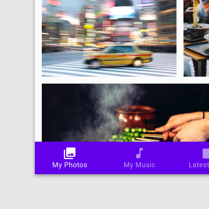
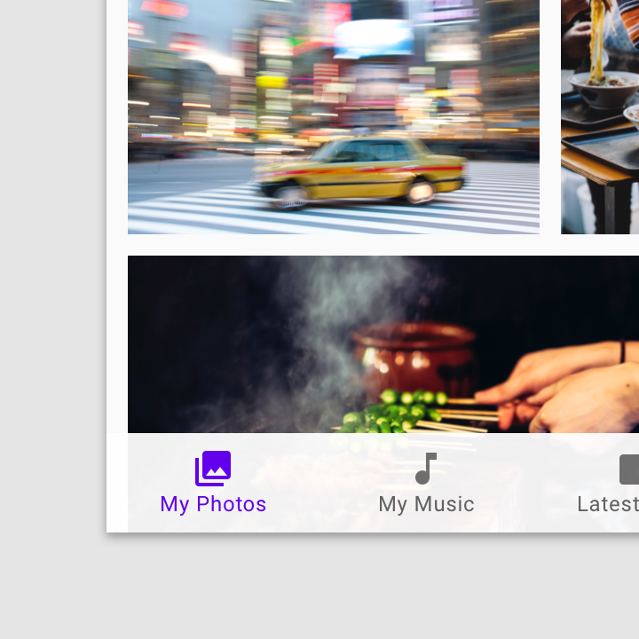
Surfaces can remain in a fixed position. The top app bar (1) remains in a fixed position while the card collection (2) scrolls only vertically behind it.
サーフェスは固定された位置にとどまることができます。 上部のアプリケーションバー(1)は固定された位置のままで、カードコレクション(2)はその背後で垂直方向にのみスクロールします。
Surfaces (1,2) can move in any direction, although movement can be confined to a single axis at a time.
サーフェス(1,2)は任意の方向に移動できますが、移動は一度に1つの軸に限定できます。
Surfaces can move in any direction.
サーフェスは任意の方向に移動できます。
Surfaces can move independently of each other, or their movement can affect or be dependent upon the movement of other surfaces.
サーフェスは互いに独立して動くことができます。または、サーフェスは他のサーフェスの動きに影響を与えることができます。
A dependency can be based on a variety of mechanics, such as nearby surfaces moving when another surface expands, or the proportion of movement between surfaces moving in parallax.
依存関係は、別のサーフェスが拡大すると移動する近くのサーフェスや、視差を移動するサーフェス間の移動の割合など、さまざまなメカニクスに基づいています。
Surfaces can move independently of each other.
サーフェスは互いに独立して動くことができます。
One surface’s movement can depend upon another’s movement.
一方の面の動きは別の面の動きに依存することがあります。
Surface opacity
サーフィスの不透明度
Material surfaces can be transparent, semi-transparent, or opaque.
Material surfaces can be transparent, semi-transparent, or opaque.
マテリアルサーフェスは、透明、半透明、または不透明にすることができます。
Text on transparent and semi-transparent surfaces may require background treatment to preserve legibility.
透明または半透明のテキストのテキストには、判読性を維持するために背景処理が必要な場合があります。
Transparent surfaces lack clear edges, making it difficult to determine where surfaces begin and end, and which surface content belongs to.
透明なサーフェスにはエッジがないため、サーフェスの始点と終点、およびサーフェイスコンテンツの属する場所を特定することが困難です。
Caution.
- Content on transparent or semi-transparent surfaces may need a background treatment to preserve legibility.
透明または半透明のサーフェス上のコンテンツは、判読性を維持するためにバックグラウンド処理が必要な場合があります。 - Isometric view
等角投影図
Don’t.
- Don’t use transparent surfaces, as they have no opacity, making it difficult to identify the surface on which content appears. This top app bar is transparent, making it unclear if the text appears on the app bar or the surface behind it.
透明なサーフェスを使用しないでください。透明なサーフェスは不透明でないため、コンテンツが表示されるサーフェスを特定することが困難です。 このトップアプリバーは透明です。アプリバーやその背後のサーフェスにテキストが表示されているかどうかは不明です。 - Isometric view
等角投影図
Scrim
スクリム
Scrims are temporary treatments that can be applied to Material surfaces for the purpose of making content on a surface less prominent. They help direct...
Scrims are temporary treatments that can be applied to Material surfaces for the purpose of making content on a surface less prominent. They help direct user attention to other parts of the screen, away from the surface receiving a scrim.
スクリムは、サーフェス上のコンテンツをあまり目立たないようにするために、マテリアルサーフェスに適用できる一時的な処理です。 彼らはスクリムを受け取るサーフィスから離れて、画面の他の部分にユーザーの注意を向けるのを助けます。
Scrims can be applied in a variety of ways, including:
スクリムは、以下を含む様々な方法で適用することができます。
- Darkening or lightening the surface and its content
表面とその内容を暗くしたり明るくしたりする - Reducing the opacity of the surface and its content
サーフィスとその内容の不透明度を下げる
Multiple surfaces on a screen at a time can display scrims. Scrims can appear at any elevation, whether in the foreground or background.
一度に画面上の複数のサーフェスにスクリムを表示できます。 スクリムは、フォアグラウンドでもバックグラウンドでも、どの高度でも表示できます。

Foundation
https://material.io/design/foundation-overview/#addition
Foundation
基盤
Material Design defines the qualities that can be expressed by UI regions, surfaces, and components. Design and strategize how your app is built using foundations that address design from both a broad and detailed perspective.
マテリアルデザインは、UIリージョン、サーフェス、およびコンポーネントで表現できる品質を定義します。 幅広く詳細な視点からデザインに取り組む基盤を使って、あなたのアプリがどのように構築されるかを設計し、戦略を立てます。
Layout, color, and more
レイアウト、色など
This section describes the Material environment and layout, its possible interactions, and the unified expression of qualities like color, shape, and motion.
このセクションでは、マテリアル環境とレイアウト、その可能な対話、色、形、モーションなどの品質の統一された表現について説明します。
iOS Design Themes

iOS Design Themes
iOSデザインテーマ
As an app designer, you have the opportunity to deliver an extraordinary product that rises to the top of the App Store charts. To do so, you'll need to meet high expectations for quality and functionality.
アプリのデザイナーとして、あなたはApp Storeのチャートのトップに載るような特別な製品を提供する機会を持っています。 そのためには、品質と機能性に対する高い期待に応える必要があります。
Three primary themes differentiate iOS from other platforms:
3つの主なテーマは、iOSを他のプラットフォームと区別します:
-
Clarity. Throughout the system, text is legible at every size, icons are precise and lucid, adornments are subtle and appropriate, and a sharpened focus on functionality motivates the design. Negative space, color, fonts, graphics, and interface elements subtly highlight important content and convey interactivity.
明瞭さ。システム全体を通して、テキストはあらゆるサイズで見やすく、アイコンは正確で明瞭であり、装飾は繊細で適切であり、機能性に研ぎ澄まされた焦点を当てることでデザインが動機付けられる。 ネガティブスペース、色、フォント、グラフィックス、インターフェース要素は、重要なコンテンツを繊細に強調し、インタラクティブ性を伝えます。 -
Deference. Fluid motion and a crisp, beautiful interface help people understand and interact with content while never competing with it. Content typically fills the entire screen, while translucency and blurring often hint at more. Minimal use of bezels, gradients, and drop shadows keep the interface light and airy, while ensuring that content is paramount.
(コンテンツへの)敬意。滑らかな動きをもった、鮮明で美しいインターフェイスは、人々が抵抗なくコンテンツを理解し、対話するのを助けます。 透過性とぼかしはしばしばより多くのヒントになるのに対し、コンテンツは通常、画面全体を満たします。 ベゼル、グラデーション、およびドロップシャドウの使用を最小限に抑えて、インターフェイスを軽くしっかりと保ちながら、コンテンツが最も重要です。 -
Depth. Distinct visual layers and realistic motion convey hierarchy, impart vitality, and facilitate understanding. Touch and discoverability heighten delight and enable access to functionality and additional content without losing context. Transitions provide a sense of depth as you navigate through content.
奥行き。明確なビジュアルレイヤーと現実に即したモーションは、階層を伝え、活力を与え、理解を促進します。 タッチと検出可能性は、喜びを高め、コンテキストを失うことなく機能と追加のコンテンツへのアクセスを可能にします。 トランジションは、コンテンツをナビゲートする際の奥行き感を提供します。
Design Principles
デザイン原則
To maximize impact and reach, keep the following principles in mind as you imagine your app’s identity.
インパクトとリーチを最大限に高めるには、アプリのアイデンティティを想像しつつ、次の原則に則ってください。
Aesthetic Integrity
美しく整合がとれていること
Aesthetic integrity represents how well an app’s appearance and behavior integrate with its function. For example, an app that helps people perform a serious task can keep them focused by using subtle, unobtrusive graphics, standard controls, and predictable behaviors. On the other hand, an immersive app, such as a game, can deliver a captivating appearance that promises fun and excitement, while encouraging discovery.
美しく整合がとれていることとは、すなわちアプリの外観と振る舞いがその機能とどれだけうまく統合されているかを表します。 たとえば、人々が深刻な作業を行うのを助けるアプリは、繊細で控えめなグラフィックス、標準コントロール、予測可能な行動を使用することで、集中しておくことができます。 一方、ゲームなどの臨場感あふれるアプリは、魅惑的な外観を提供し、楽しみと興奮を約束をあたえ、新しい発見を促します。
Consistency
一貫性
A consistent app implements familiar standards and paradigms by using system-provided interface elements, well-known icons, standard text styles, and uniform terminology. The app incorporates features and behaviors in ways people expect.z
一貫したアプリケーションは、 「システム標準のインターフェイス要素」 「よく知られたアイコン」 「標準的なテキストスタイル」 「統一された用語」を使用して、馴染みある標準UIパターンを実装します。 このようなアプリは、ユーザの期待通りの機能や動作を備えています。
Direct Manipulation
直接操作
The direct manipulation of onscreen content engages people and facilitates understanding. Users experience direct manipulation when they rotate the device or use gestures to affect onscreen content. Through direct manipulation, they can see the immediate, visible results of their actions.
画面上のコンテンツを直接操作することで、ユーザの意識をとらえ、理解を促進します。ユーザーは、デバイスの回転やジェスチャーを使用して画面上のコンテンツに影響を与えることで、直接的な操作を経験します。直接操作を介して、彼らは自分の行動の結果をただちに視認できます。
Feedback
フィードバック
Feedback acknowledges actions and shows results to keep people informed. The built-in iOS apps provide perceptible feedback in response to every user action. Interactive elements are highlighted briefly when tapped, progress indicators communicate the status of long-running operations, and animation and sound help clarify the results of actions.
フィードバックは人々の行動をとらえ、結果を示して情報を提供するものです。iOSアプリは、すべてのユーザー操作に対応して認識可能なフィードバックを提供します。インタラクティブな要素は、タップすると即座にハイライトされ、進行状況インジケータは長時間実行される操作の状態を伝え、アニメーションとサウンドはアクションの結果を明確にします。
Metaphors
メタファー
People learn more quickly when an app’s virtual objects and actions are metaphors for familiar experiences—whether rooted in the real or digital world. Metaphors work well in iOS because people physically interact with the screen. They move views out of the way to expose content beneath. They drag and swipe content. They toggle switches, move sliders, and scroll through picker values. They even flick through pages of books and magazines.
アプリ内のオブジェクトやアクションが、実世界やデジタルの世界の馴染みの体験をメタファとしていると、それが何を表すのかをユーザはすばやく学習できます。 メタファはタッチデバイスでは特に有効です。なぜなら、人々は物理的に画面とやり取りするからです。彼らは、隠れたコンテンツを見るために画面を直接指でスライドします。彼らはコンテンツをドラッグしてスワイプします。スイッチの切り替え、スライダの移動、ピッカー値のスクロールを行います。本や雑誌のページをめくったりもします。
User Control
ユーザーコントロール
Throughout iOS, people—not apps—are in control. An app can suggest a course of action or warn about dangerous consequences, but it’s usually a mistake for the app to take over the decision-making. The best apps find the correct balance between enabling users and avoiding unwanted outcomes. An app can make people feel like they’re in control by keeping interactive elements familiar and predictable, confirming destructive actions, and making it easy to cancel operations, even when they’re already underway.
iOSを操作するのは、アプリではなく人です。アプリは、操作方法を示唆するか、危険な結果について警告することができますが、通常、アプリが意思決定まで行うような形をとってはいけません。最高のアプリは、ユーザー補助・支援と、望ましくない結果からの回避を適切なバランスを行います。アプリは、インタラクティブな要素を使い慣れた状態に保ち、破壊的な行動をしないか監視し、処理中であっても簡単にキャンセルできることで、ユーザが自ら支配しているように感じられる状態を保ちます。
Introduction
https://material.io/design/introduction/
Introduction
Material Design is a visual language that synthesizes the classic principles of good design with the innovation of technology and science.
マテリアルデザインは、優れた設計の古典的原則を技術と科学の革新と合成する視覚的言語です。
Goals
Create a visual language that synthesizes the classic principles of good design with the innovation and possibility of technology and science. Develop a single underlying...
Create
Create a visual language that synthesizes the classic principles of good design with the innovation and possibility of technology and science.
技術と科学の革新性と可能性を備えた優れたデザインの古典的原則を合成するビジュアル言語を作成します。
Unify
Develop a single underlying system that unifies the user experience across platforms, devices, and input methods.
プラットフォーム、デバイス、およびインプットメソッド間のユーザーエクスペリエンスを統一する単一の基盤システムを開発します。
Customize
Expand Material’s visual language and provide a flexible foundation for innovation and brand expression.
マテリアルデザインのビジュアル言語を拡張し、革新とブランド表現のための柔軟な基盤を提供します。
Principles
原則
Material Design is inspired by the physical world and its textures, including how they reflect light and cast shadows. Material surfaces reimagine the mediums of...
Material is the metaphor
Material Design is inspired by the physical world and its textures, including how they reflect light and cast shadows. Material surfaces reimagine the mediums of paper and ink.
マテリアルデザインは、光とキャストシャドウをどのように反映するかなど、物理的な世界とそのテクスチャからインスピレーションを得ています。 マテリアルサーフェスは、紙とインクのメディアを再イメージします。
Bold, graphic, intentional
太字、グラフィック、意図的
Material Design is guided by print design methods — typography, grids, space, scale, color, and imagery — to create hierarchy, meaning, and focus that immerse viewers in the experience.
マテリアルデザインは、タイポグラフィ、グリッド、スペース、尺度、色、画像などのプリントデザイン方法によって、視聴者の経験を浸透させる階層、意味、およびフォーカスを作成します。
Motion provides meaning
モーションは意味を提供する
Motion focuses attention and maintains continuity, through subtle feedback and coherent transitions. As elements appear on screen, they transform and reorganize the environment, with interactions generating new transformations.
繊細なフィードバックや一貫性のある移行を通じて、モーションは注意を集中し、継続性を維持します。 要素は画面に表示されるので、環境を変換して再構成し、相互作用によって新しい変換を生成します。
Flexible foundation
柔軟な基礎
The Material Design system is designed to enable brand expression. It’s integrated with a custom code base that allows the seamless implementation of components, plug-ins, and design elements.
マテリアルデザインシステムは、ブランド表現を可能にするように設計されています。 コンポーネント、プラグイン、およびデザイン要素をシームレスに実装できるカスタムコードベースと統合されています。
Cross-platform
クロスプラットフォーム
Material Design maintains the same UI across platforms, using shared components across Android, iOS, Flutter, and the web.
マテリアルデザインは、Android、iOS、Flutter、およびWebの共有コンポーネントを使用して、プラットフォーム間で同じUIを維持します。
Getting around
Updates
Material is designed to evolve over time. Starting in May 2018, we’ll deliver on a monthly release cadence to increase the expressive capabilities of the...
Material is designed to evolve over time. Starting in May 2018, we’ll deliver on a monthly release cadence to increase the expressive capabilities of the Material Design system, bringing you even more Material Theming capability.
マテリアルデザインは時間とともに進化するように設計されています。 2018年5月からは、マテリアルデザインシステムの表現力を高めるために毎月リリースするケイデンスを提供し、より多くのマテリアルテーミング機能を提供します。
Sign up to receive release notifications by email, and view the latest release notes and release plan on GitHub.
Widgets
https://developer.apple.com/design/human-interface-guidelines/ios/extensions/widgets/
Widgets
A widget is an extension that displays a small amount of timely, useful information or app-specific functionality. For example, the News widget shows top headlines. Calendar provides two widgets, one that shows today’s events and one that shows what’s up next. Notes lets you preview recent notes and quickly create new notes, reminders, photos, and drawings. Widgets are highly customizable and can contain buttons, text, layout customizations, images, and more.
ウィジェットは、少量のタイムリーな有用な情報やアプリ固有の機能を表示する拡張機能です。 たとえば、Newsウィジェットにはトップヘッドラインが表示されます。 カレンダーは2つのウィジェットを提供します.1つは今日のイベントを表示し、もう1つは次のイベントを表示します。 メモを使用すると、最近のメモをプレビューして、新しいメモ、メモ、写真、および図面をすばやく作成できます。 ウィジェットは高度にカスタマイズ可能で、ボタン、テキスト、レイアウトのカスタマイズ、画像などを含めることができます。
Widgets appear above the quick action list when you apply pressure to an app icon on the Home screen using 3D Touch. People also add the widgets they care about to the Search screen, which is accessed by swiping to the right on the Home screen and the Lock screen. Your goal should be to design a widget that people want to add to the Search screen.
3Dタッチを使用してホーム画面のアプリアイコンにプレッシャーをかけると、ウィジェットはクイックアクションリストの上に表示されます。 また、気になるウィジェットを検索画面に追加できます。検索画面には、ホーム画面とロック画面の右にスワイプしてアクセスします。 あなたの目標は、人々が検索画面に追加したいウィジェットを設計することです。

Search screen widgets

Home screen quick action widget
Design a great glanceable experience. People use widgets to get brief updates and perform very simple tasks, so it’s essential to deliver the right amount of information and interactivity. Wherever possible, provide tasks that can be completed in a single tap. Panning and scrolling within widgets isn’t supported.
素晴らしい幻想的な体験をデザインしましょう。 人々はウィジェットを使用して簡単なアップデートを取得し、非常に簡単なタスクを実行するので、適切な量の情報とインタラクティブ性を提供することが不可欠です。 可能な限り、1回のタップで完了できるタスクを提供してください。 ウィジェット内のパンとスクロールはサポートされていません。
Show content quickly. People spend very little time looking at widgets and shouldn’t need to wait for content to load. Cache information locally so you can always show recent information while getting updates.
コンテンツをすばやく表示する。 人々はウィジェットを見るのに少しでも時間を費やし、コンテンツが読み込まれるのを待つ必要はありません。 情報をローカルにキャッシュすることで、最新の情報を表示しながら更新を取得することができます。
Provide ample margins and padding. Avoid extending content to the edges of a widget. In general, provide a margin of at least a few pixels between each edge and the content. Use the app icon at the top of your widget for alignment guidance. Content tends to work well when lined up with the center of this icon. If your app offers a grid-style layout, make sure you provide sufficient and equal padding between grid items. If possible, limit grids of icons and buttons to four per row.
十分なマージンとパディングを提供する。 コンテンツをウィジェットの端まで拡張しないでください。 一般に、各エッジとコンテンツの間に少なくとも数ピクセルのマージンを設けます。 ウィジェットの上部にあるアプリアイコンを使用して、アライメントのガイダンスを表示します。 コンテンツは、このアイコンの中央に並んでいるとうまくいく傾向があります。 あなたのアプリがグリッドスタイルのレイアウトを提供している場合、グリッドアイテム間に十分な平等なパディングを提供するようにしてください。 可能であれば、アイコンとボタンのグリッドを1行につき4つに制限します。
Be adaptable. The width of a widget varies, depending on the device and orientation. The height and information displayed by a widget depends on whether it’s collapsed or expanded (not all widgets support expansion). A collapsed widget is the height of roughly two and a half table rows. An expanded widget is ideally no taller than the height of the screen. The quick action list only shows widgets in a collapsed state. When collapsed, a widget shows essential information that can stand alone. When expanded, a widget shows additional information that enhances the primary information. The Weather widget, for example, shows the current weather conditions when collapsed, but adds the hourly forecast when expanded.
適応可能にする。 ウィジェットの幅は、デバイスおよびオリエンテイションによって異なります。 ウィジェットによって表示される高さと情報は、ウィジェットが折りたたまれているか、または展開されているかによって異なります(すべてのウィジェットが閉じ開きをサポートしているわけではありません)。 折りたたまれたウィジェットは、およそテーブル行2.5行分の高さです。 拡張されたウィジェットの高さは画面の高さを超えるべきではありません。 クイックアクションリストには、折りたたまれた状態のウィジェットのみが表示されます。 折りたたまれたとき、ウィジェットは、単独で成り立つ重要な情報を示します。 展開すると、ウィジェットは主情報を強化する追加情報を表示します。 たとえば、Weatherウィジェットは、折りたたまれたときの現在の気象条件を表示しますが、展開時の時間別の予測を追加します。
Avoid customizing the background of a widget. The light, blurred widget background provided by the system is designed for consistency and legibility. Use it whenever possible. Never use a photo as a background, as it may clash with the Lock and Home screen wallpaper.
ウィジェットの背景をカスタマイズしないでください。 システムによって提供される明るくぼやけたウィジェットの背景は、一貫性と読みやすさを考慮して設計されています。 可能な限り使用してください。 ロックとホーム画面の壁紙と衝突する可能性があるため、写真を背景として使用しないでください。
In general, use the system font in black or dark gray for text. The system font is designed for legibility, and dark colors work well with the standard widget background.
一般的には、テキストにはシステムフォントを黒または濃い灰色で使用します。 システムフォントは見やすさのために設計されており、暗い色は標準的なウィジェットの背景とうまく機能します。
When appropriate, let people jump to your app to do more. Your widget should operate independently from your app. However, if people might occasionally need to do more than what your widget offers, make it easy to do so. Don’t include an “Open App” button that takes space away from your content. Instead, let people tap the content itself to see or edit it in your app. In the Calendar widget, for example, you can tap an event to open it in the Calendar app. Never use your widget to open other apps.
必要に応じて、ユーザにあなたのアプリへとジャンプさせ、より多くのことをさせる。 あなたのウィジェットはあなたのアプリから独立して動作するはずです。 しかし、ウィジェットが提供する以上のものを人々が必要とすることがある場合は、簡単にそれを提供することができます。 あなたのコンテンツから離れてしまう「アプリケーションを開く」ボタンを含めないでください。 代わりに、ユーザーがコンテンツ自体をタップしてアプリで表示または編集できるようにします。 たとえば、カレンダーウィジェットでは、イベントをタップしてカレンダーアプリで開くことができます。 ウィジェットを使用して他のアプリを開かないでください。
Pick a good widget name. An app icon and a title appear above each widget’s content. In general, your widget’s name should match your app’s name. If your app offers multiple widgets, consider using your app name for the primary one and clear, concise names for the others. If you use custom titles, consider prefixing them with your app name. For example, the Maps widget for showing nearby locations is titled Maps Nearby. The inclusion of your app name instills confidence that the widget is in fact provided by your app.
良いウィジェット名を選んでください。 アプリアイコンとタイトルが各ウィジェットのコンテンツの上に表示されます。 一般に、ウィジェットの名前はアプリの名前と一致する必要があります。 あなたのアプリが複数のウィジェットを提供している場合は、最初のもののアプリ名と他のウィジェットの明快で簡潔な名前の使用を検討してください。 カスタムタイトルを使用する場合は、それらのプレフィックスにアプリ名を付けることを検討してください。 たとえば、近くの場所を表示するための地図ウィジェットの名前は「近くの地図」です。 あなたのアプリ名を含めると、実際にあなたのアプリからウィジェットが提供されているという確信が得られます。
Let people know when authentication adds value. If your widget provides additional functionality when someone is logged into your app, make sure people know about this. For example, an app that shows upcoming reservations might include a message that says “Sign into the app to view your reservations.” when people aren’t logged in.
認証情報を与える時に人々に知らせる。 誰かがあなたのアプリにログインしているときにあなたのウィジェットが追加の機能を提供するならば、人々がこれについて知っていることを確認してください。 たとえば、予定されている予約を表示するアプリには、ユーザーがログインしていないときに「あなたの予約を表示するためにアプリにログインする」というメッセージが表示される場合があります。
Choose a widget for the quick action list. If your app has multiple widgets, pick one to appear in the quick action menu that appears when someone applies pressure to your app icon on the Home screen using 3D Touch.
クイックアクションリストのウィジェットを選択します。 あなたのアプリに複数のウィジェットがある場合、誰かが3Dタッチを使用してホーム画面のアプリアイコンにプレッシャーをかけるときに表示されるクイックアクションメニューに表示するものを選択します。
For developer guidance, see App Extension Programming Guide.
Sharing and Actions
https://developer.apple.com/design/human-interface-guidelines/ios/extensions/sharing-and-actions/
Sharing and Actions
シェアとアクション
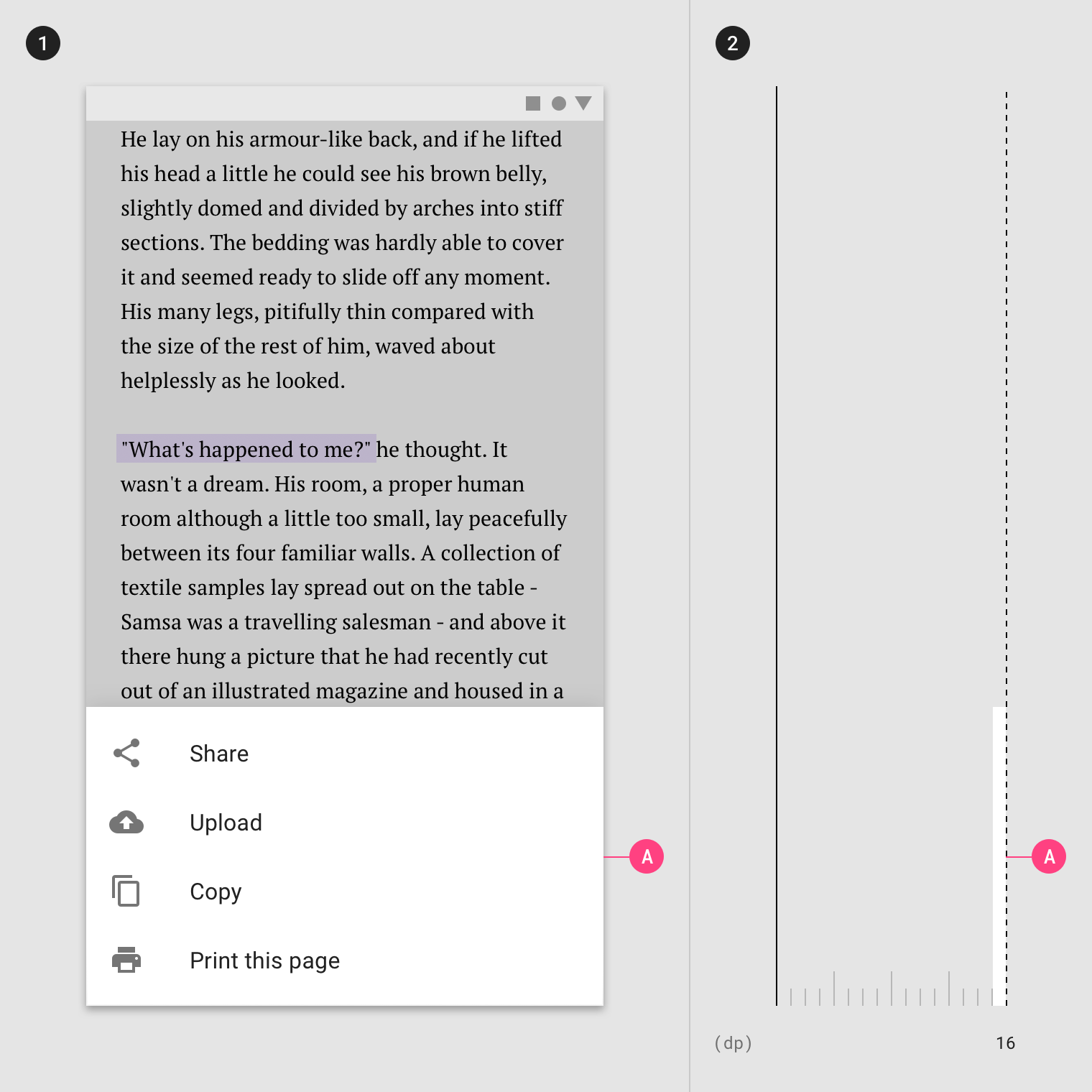
Share extensions provide a convenient way to share information from the current context with apps, social media accounts, and other services. Action extensions let people initiate content-specific tasks, such as adding a bookmark, copying a link, or saving an image. People access share extensions and action extensions by tapping an Action button in an app to display an activity view. An activity view shows only extensions relevant to the current context. You wouldn’t see text manipulation actions while editing a video, for example. Within an activity view, share extensions are listed above action extensions.
共有拡張機能は、現在のコンテキストの情報をアプリ、ソーシャルメディアアカウント、その他のサービスと簡単に共有する方法を提供します。 アクション拡張機能を使用すると、ブックマークの追加、リンクのコピー、画像の保存などのコンテンツ固有のタスクを開始できます。 ユーザーは、アプリ内のアクションボタンをタップしてアクティビティビューを表示することにより、共有拡張機能やアクション拡張にアクセスします。 アクティビティビューには、現在のコンテキストに関連する拡張機能のみが表示されます。 たとえば、ビデオの編集中にテキスト操作アクションは表示されません。 アクティビティビュー内では、シェアーエクステンションが上記のアクション拡張機能のリストに表示されます。

Enable a single, focused task. An extension isn’t a mini-app. It performs a narrowly scoped task related to the current context.
フォーカスされた一つのタスクを有効にします。 拡張機能はミニアプリではありません。 現在のコンテキストに関連する狭いスコープのタスクを実行します。
Craft a familiar interface. For share extensions, the system-provided composition view is familiar and provides a consistent sharing experience throughout the system. Use it whenever possible. For action extensions, include your app name, or design an interface that’s recognizable and feels like a natural extension of your app.
使い慣れたインタフェースを作ります。 シェア・エクステンションの場合、システム提供のコンポジション・ビューは使い慣れたものであり、システム全体で一貫した共有体験を提供します。 可能な限り使用してください。 アクションエクステンションの場合、アプリ名を含めるか、認識可能で、アプリの自然な拡張機能のようなインターフェースをデザインします。
Streamline and limit interaction. The best extensions let people perform a task in just a few steps. For example, a share extension might immediately post an image to a social media account with a single tap. Only provide an interface when necessary.
合理化と制限の相互作用。 最善の拡張機能は、人々がほんの数ステップでタスクを実行できるようにします。 たとえば、シェアを共有すると、1回のタップでソーシャルメディアアカウントに画像がすぐに投稿されることがあります。 必要なときにのみインタフェースを提供してください。
Avoid placing modal views above your extension. Extensions are displayed within a modal view by default. While an alert might make sense above an extension, avoid layering additional modal views.
エクステンションの上にモーダル表示を配置しないでください。 拡張機能はデフォルトでモーダルビュー内に表示されます。 アラートは拡張機能の上で意味をなさないかもしれないので、追加のモーダルビューを重ねることは避けてください。
Use your main app to denote the progress of lengthy operations. An activity view should dismiss immediately after initiating sharing or an action. Time-consuming tasks should continue in the background, and your main app should provide some way to check the status of these tasks. Don’t use notifications for this. People don’t want to see a notification every time a task completes, although it’s fine to notify them if there’s a problem.
長時間の操作の進捗状況を示すには、メインアプリを使用します。 アクティビティビューは、共有またはアクションを開始した直後に解除する必要があります。 時間のかかるタスクはバックグラウンドで継続する必要があり、メインアプリケーションはこれらのタスクの状態を確認するための何らかの手段を提供する必要があります。 このために通知を使用しないでください。 人々は、タスクが完了するたびに通知を見たいとは思っていませんが、トラブルが発生した際には通知することは問題ありません。
Use a template image for an action extension icon. A template image uses a mask to create an icon. Use black and white with appropriate transparency and antialiasing, and don’t include a drop shadow. Template images should be centered in an area measuring about 70px × 70px.
アクション拡張アイコンにテンプレート画像を使用します。 テンプレート画像はマスクを使用してアイコンを作成します。 適切な透明性とアンチエイリアシングを備えた白黒を使用し、ドロップシャドウは使用しないでください。 テンプレート画像は、約70ピクセル×70ピクセルの領域にセンタリングする必要があります。
For additional guidelines, see Activity Views. For developer guidance, see Share and Actionin App Extension Programming Guide.