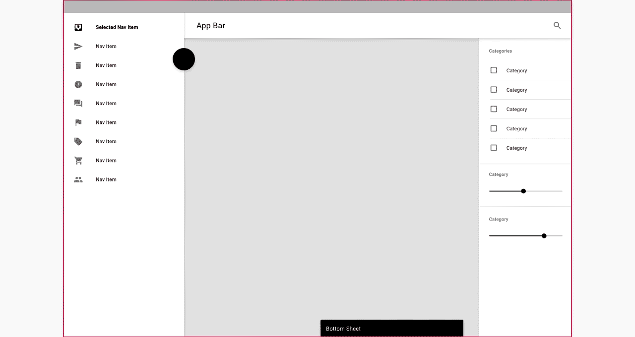
Understanding navigation
Understanding navigation
ナビゲーションの理解
Navigation enables users to move through an app.
ナビゲーションを使用すると、ユーザーはアプリ内を移動できます。

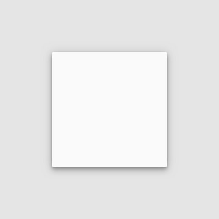
Density
Density
密度
Material Design uses low-density space by default (with large tap targets and margins) but offers high-density space when it improves the user experience.
Material Designでは、デフォルトで低密度スペースが使用されます(大きなタップターゲットとマージンがあります)が、ユーザーエクスペリエンスが向上のためには高密度スペースも使用されます。
Usage
使い方
Density principles
密度の原則
Dense UIs improve browsing and interaction with large amounts of content. Dense UIs help users focus by reducing space between actions. Density exposes more content...

Scannable
目を通しやすさ
Dense UIs improve browsing and interaction with large amounts of content.
密度設計がされたUIは、量の多いコンテンツに対する閲覧性とインタラクションを向上します。

Prioritized
優先度付け
Dense UIs help users focus by reducing space between actions.
密度設計されたUIは、アクション間の余白を縮めてユーザの集中を助けます。

Available
利用しやすさ
Density exposes more content and actions on a single screen.
密度に応じることにより、より多くのアクションやコンテンツを1画面に表示できるようになります。
When to apply density
密度を適用する場合
Whether to increase your UI’s density can be determined by how users interact with a component. Components with high density enable users to process and...
Whether to increase your UI’s density can be determined by how users interact with a component.
UIの密度を上げるかどうかは、ユーザーがコンポーネントを操作する方法によって決まります。
Components with high density enable users to process and take action against large amounts of information in a more manageable way. List, tables, and long forms are components that benefit from increased density.
高密度のコンポーネントにより、ユーザーは大量の情報をより管理しやすい方法で処理し、対処することができます。 リスト、テーブル、および長いフォームは、密度が上がることでメリットが得られるコンポーネントです。
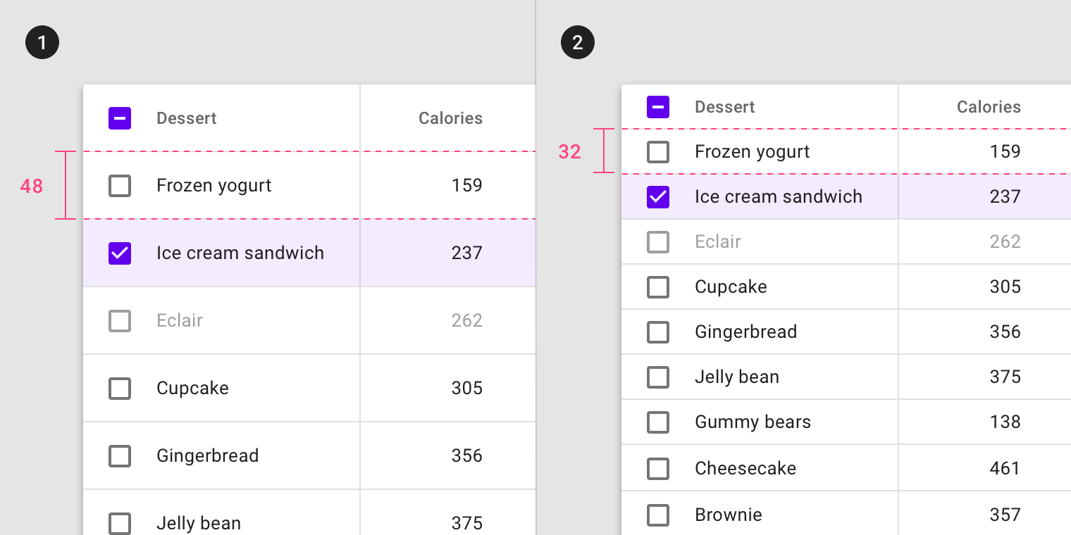
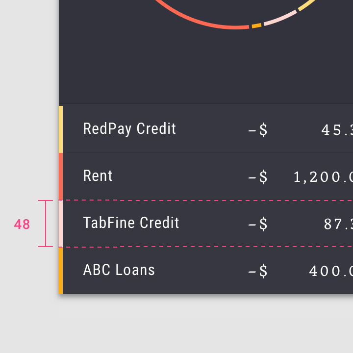
- Default density, 48dp row height
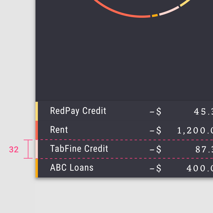
- High density, 32dp row height
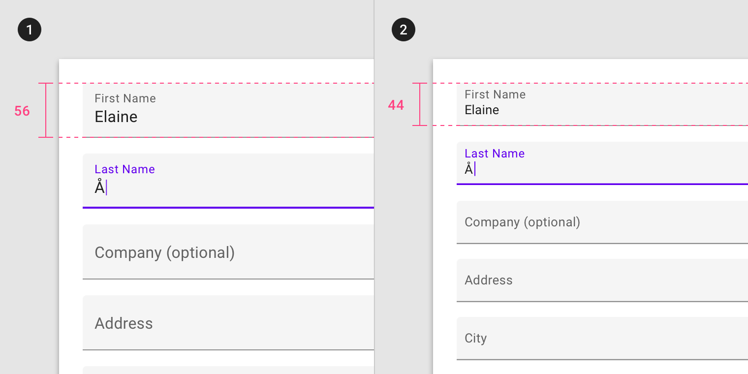
- Default density, 56dp text field height
- High density, 44dp text field height
When not to apply density
密度を適用しない場合
Don’t apply density to components that involve focused tasks, such as interacting with a dropdown menu or picker. Increasing density on these components reduces their...
High density should not be applied to task or alert-based components.
高密度は、タスクまたはアラートベースのコンポーネントには適用しないでください。
Focused tasks
集中されるタスク
Don’t apply density to components that involve focused tasks, such as interacting with a dropdown menu or picker. Increasing density on these components reduces their usability.
ドロップダウンメニューやピッカーの操作など、集中的な作業を伴うコンポーネントでは密度を上げないでください。 これらの部品の密度を上げると、使い勝手が悪くなります。
Don’t.
Don’t apply high density to a date picker, as this reduces usability.
使い勝手が悪くなるので、日付選択に高密度を適用しないでください。
Alerts and messaging
アラートとメッセージ
Don’t apply density to components that alert the user of changes, such as snackbars or dialogs. Applying high density to alerts reduces their ability to command attention.
スナックバーやダイアログなど、変更をユーザーに警告するコンポーネントには密度を適用しないでください。 アラートに高密度を適用すると、警告を出す能力が低下します。
Don’t.
Don’t apply high density to dialogs, which reduces their readability and prominence.
読みやすさや目立ちやすさを低下させるダイアログに高密度を適用しないでください。
Layout
レイアウト
Grid and component density
グリッドと部品密度
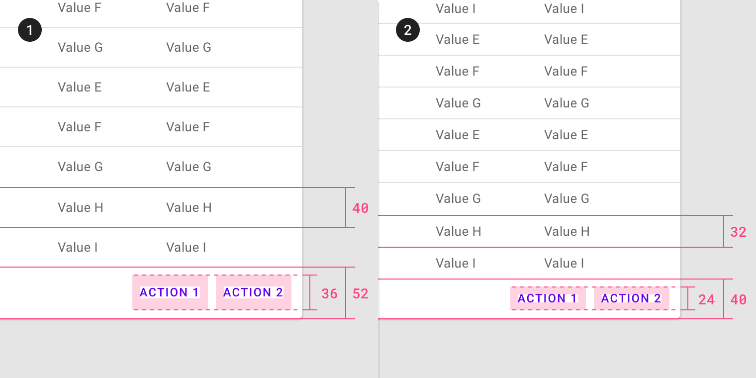
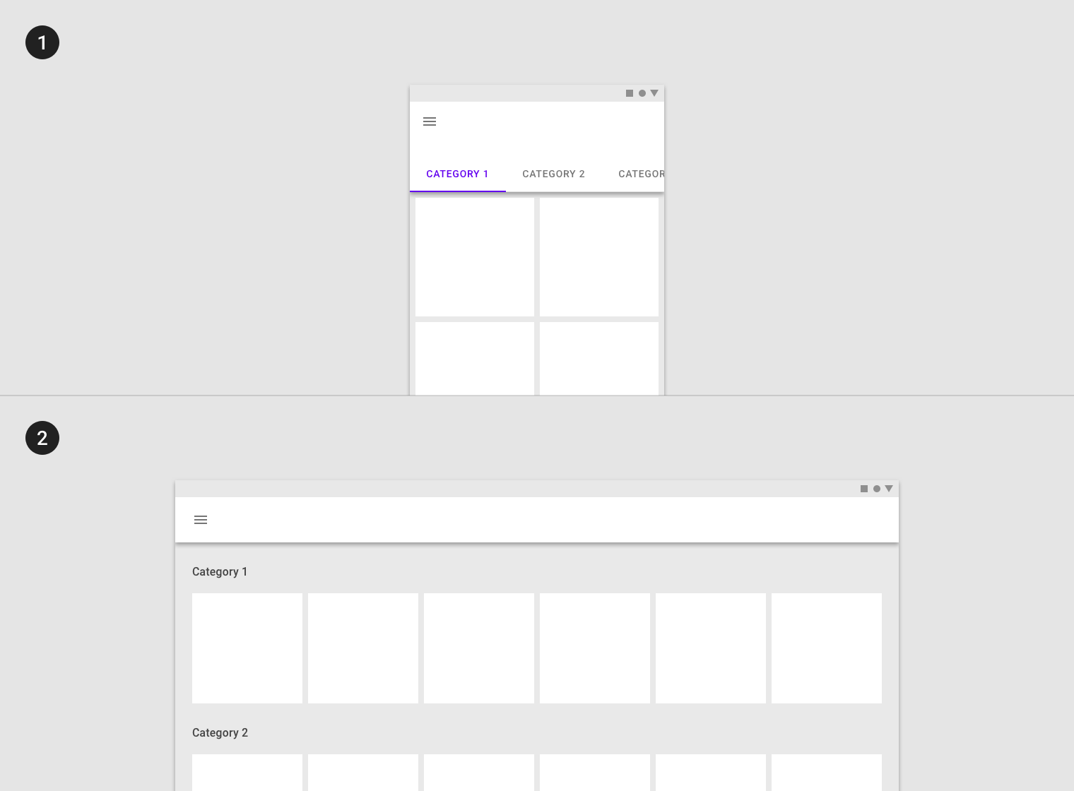
To create more scannable groups of content, use a less-dense grid layout with high-density components. The higher the density of components, the larger their margins...
To create more scannable groups of content, use a less-dense grid layout with high-density components. The higher the density of components, the larger their margins and gutter widths should be.
よりスキャンしやすいコンテンツのグループを作成するには、高密度コンポーネントを使用して密度の低いグリッドレイアウトを使用します。 コンポーネントの密度が高いほど、それらのマージンと溝幅は大きくなります。
High-density component row height, with wide margins and gutters
広い余白と溝を持つ高密度コンポーネント行の高さ
Default density component row height, with narrow margins and gutters
狭いマージンとガターを使用した、デフォルトの密度コンポーネントの行の高さ
Don’t.
Don’t use both a dense layout grid and dense components, as this will make it difficult to differentiate content groups.
密なレイアウトグリッドと密集したコンポーネントの両方を使用しないでください。コンテンツグループを区別するのが難しくなります。
Touch and click targets
タッチとクリックのターゲット
Touch target specs
タッチ対象スペック
Touch targets apply to any device that receives both touch and non-touch input. To balance information density and usability, touch targets should be at least...
Touch targets apply to any device that receives both touch and non-touch input. To balance information density and usability, touch targets should be at least 48 x 48 dp, with at least 8dp of space between each target.
タッチターゲットは、タッチ入力と非タッチ入力の両方を受信するすべてのデバイスに適用されます。 情報密度と使いやすさのバランスをとるために、タッチターゲットは少なくとも48 x 48 dp、各ターゲット間に少なくとも8 dpの間隔を空けてください。

Touch target minimum of 48 x 48 dp
There are some edge cases when touch target sizes must be smaller than the recommended minimum 48dp.
タッチターゲットのサイズが推奨される最小48dpよりも小さくなければならない場合があります。

- Smaller touch targets for links within a paragraph.
段落内のリンクに対する小さなタッチターゲット。 - Smaller touch targets for a date selection in picker.
ピッカーでの日付選択のタッチターゲットが小さくなりました。
Applying density
密度に合わせる
Default density in a list
リスト内のデフォルト密度
Do.
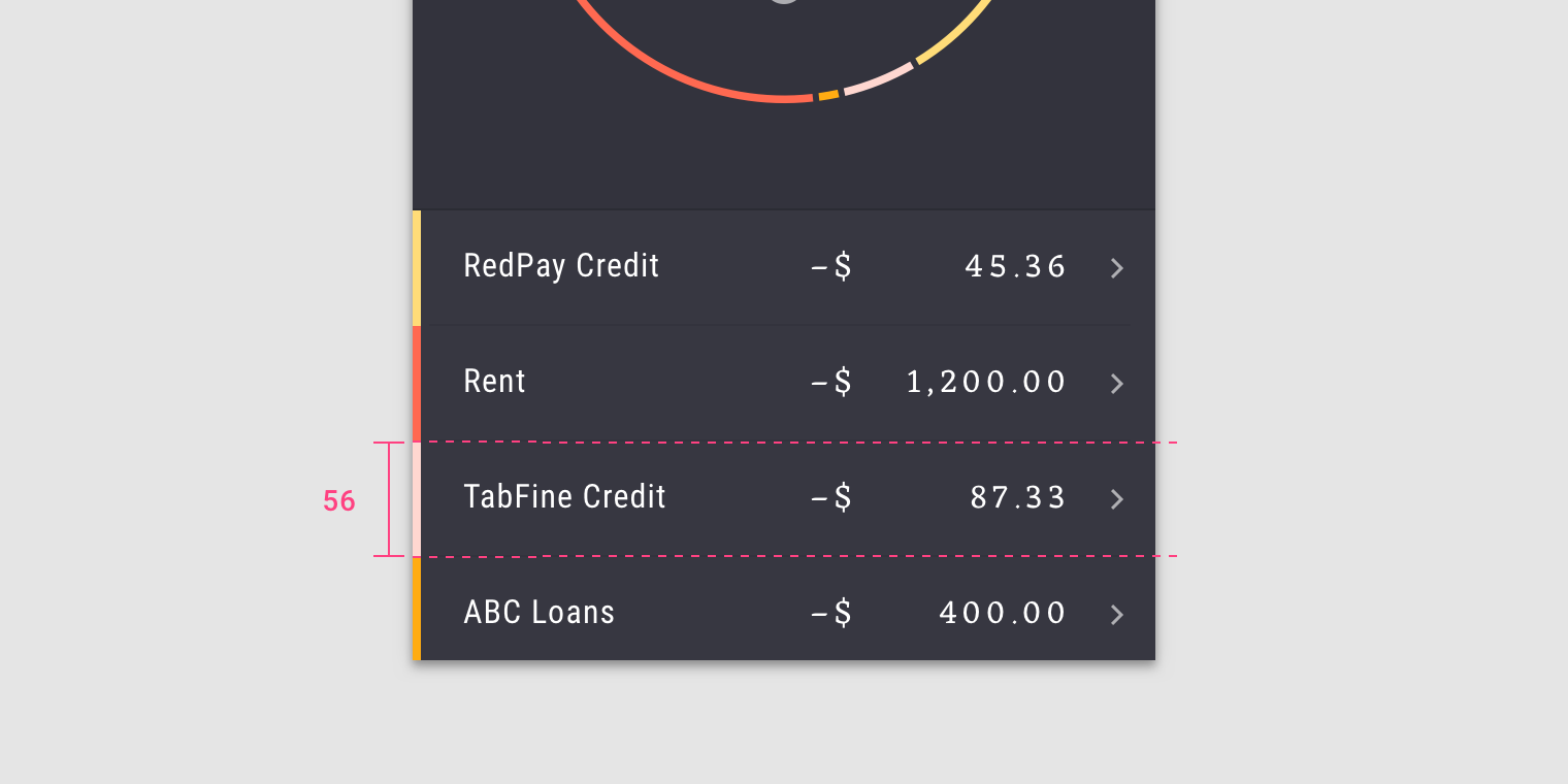
In this high-density list, the minimum space (48px) is defined by the tap target on each list item.
この高密度リストでは、最小スペース(48px)は各リストアイテムのタップターゲットによって定義されます。
Click targets
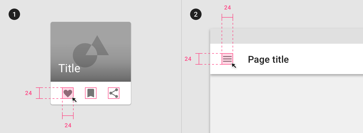
On non-touch UIs, click targets should be at least 24 x 24 dp, with at least 8dp of space between each target.
On non-touch UIs, click targets should be at least 24 x 24 dp, with at least 8dp of space between each target.
非タッチUIでは、クリックターゲットは少なくとも24 x 24 dp、各ターゲット間に少なくとも8 dpのスペースが必要です。
Click target minimum 24 x 24dp
Applying Density
密度に合わせる
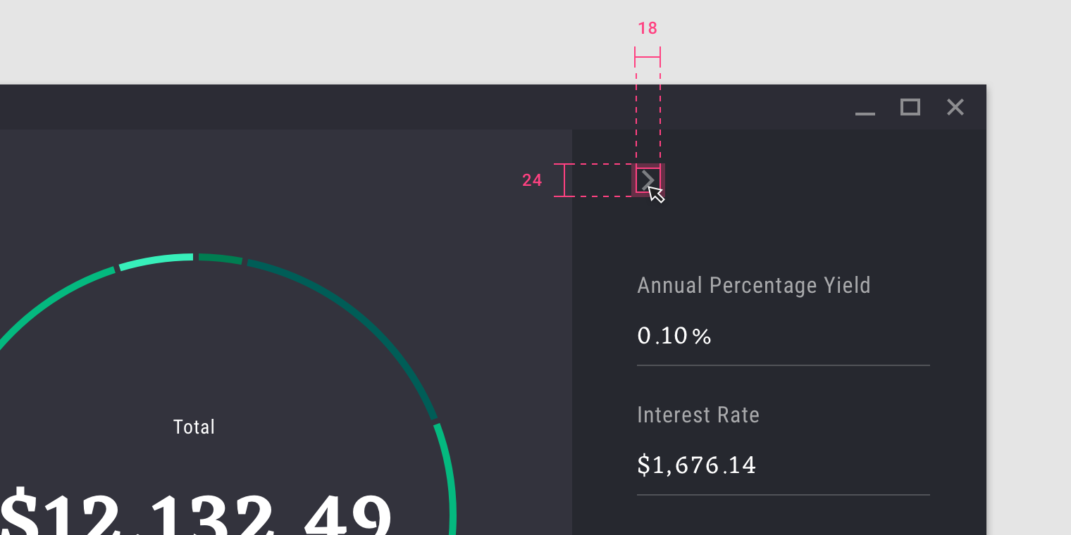
When using high-density icons (18dp), the minimum space (24px) is defined by the click target.
高密度アイコン(18dp)を使用する場合、最小スペース(24px)はクリックターゲットによって定義されます。
Typographic density
活字密度
Line height
ラインハイト
Line height is the space between lines of text. Line height can be used as a way to create density in typographic layouts. When tightening...
Line height is the space between lines of text. Line height can be used as a way to create density in typographic layouts. When tightening line height be sure to still use the 4dp baseline grid.
行の高さはテキストの行間のスペースです。 行の高さは、活版印刷レイアウトで密度を作成する方法として使用できます。 ラインの高さを引き締めるときは、必ず4dpベースライングリッドを使用してください。
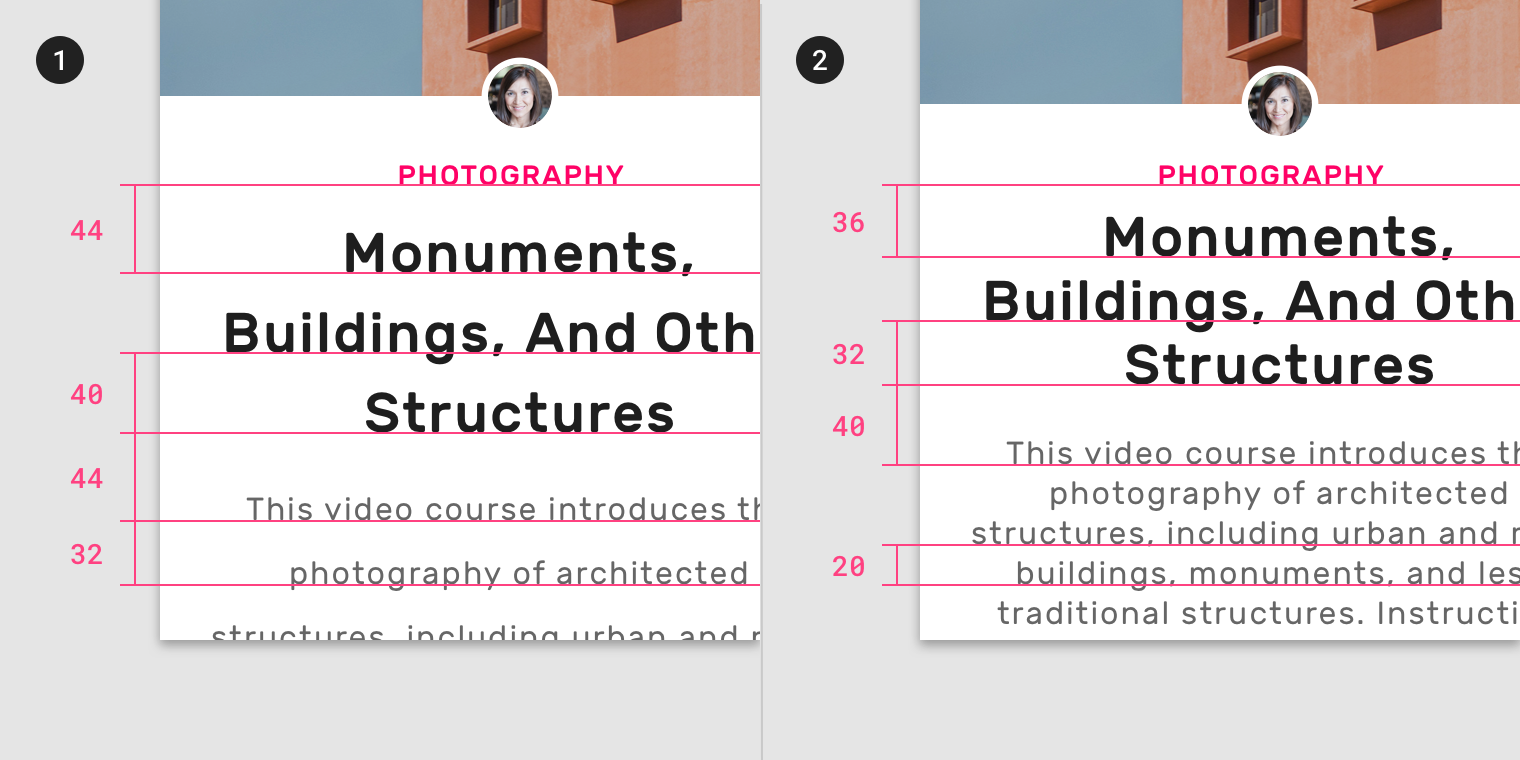
- Larger line height
- Smaller line height
Spacing methods
Spacing methods
間隔の設定メソッド
Spacing methods use baseline grids, keylines, padding, and incremental spacing to affect ratios, containers, and touch targets.
スペーシングメソッドには、ベースラインのグリッド、キーライン、パディング、増分スペーシングを使用して比率、コンテナ、およびタッチターゲットを含みます。
Responsive layout grid
Responsive layout grid
The Material Design responsive layout grid adapts to screen size and orientation, ensuring consistency across layouts.
マテリアルデザインに対応したレイアウトグリッドは、画面のサイズと向きに適応し、レイアウト全体の一貫性を保証します。
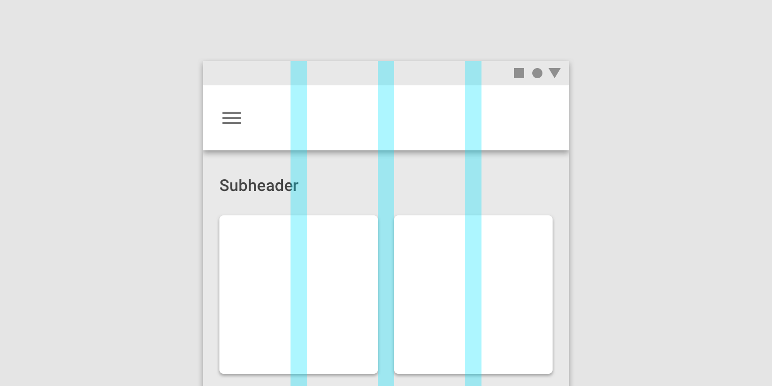
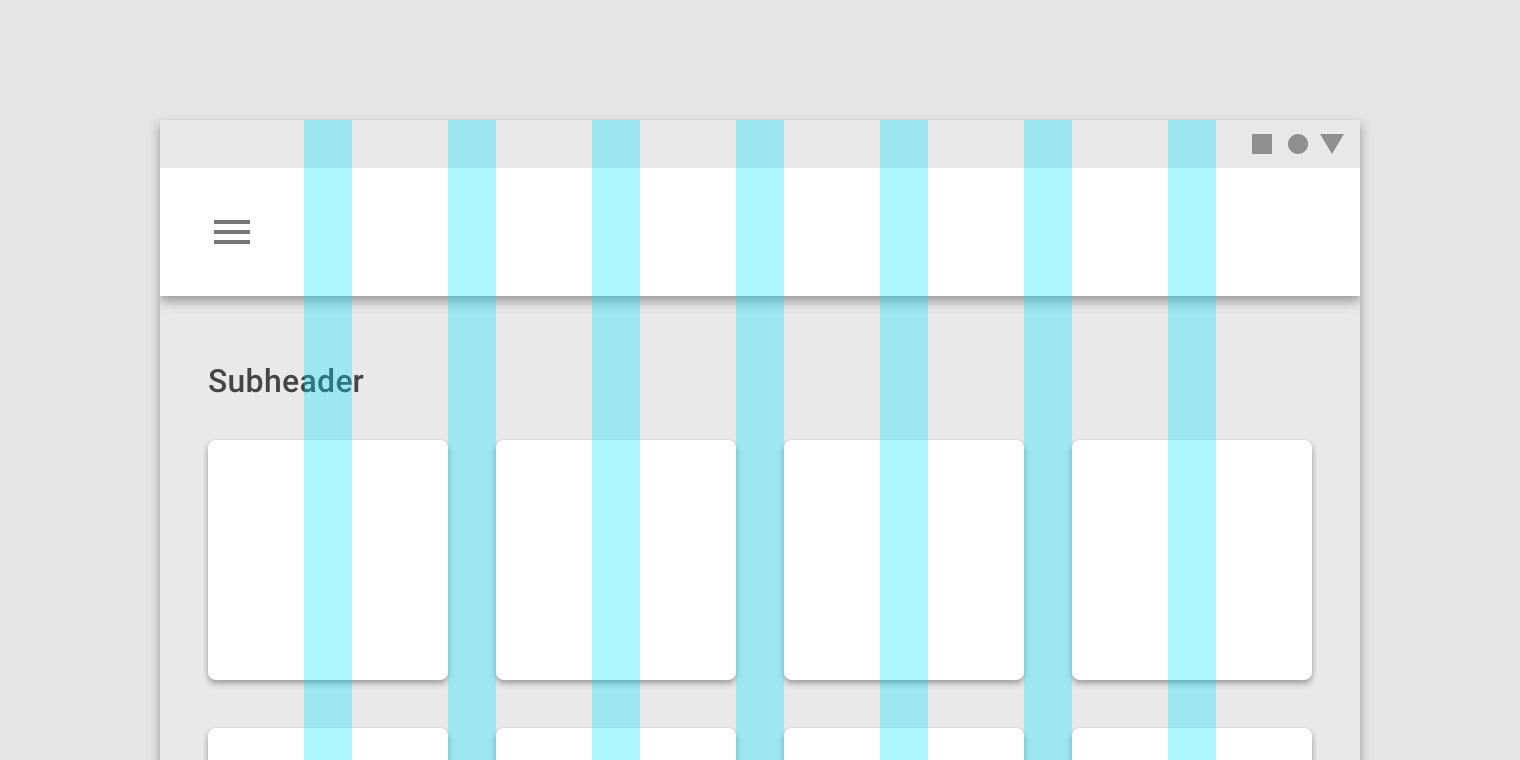
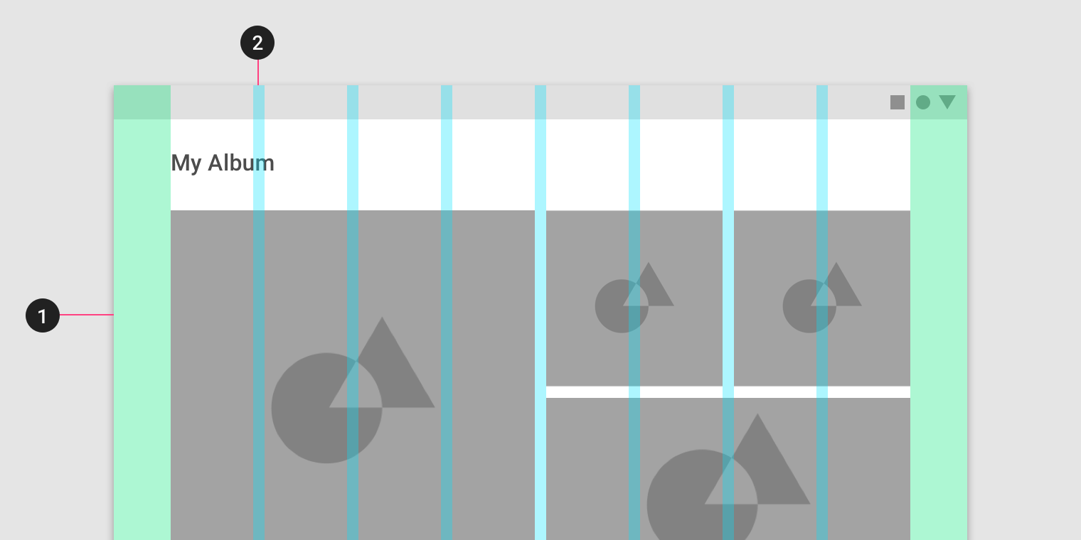
Columns, gutters, and margins
The Material Design layout grid is made up of three elements: columns, gutters, and margins.
マテリアルデザインレイアウトグリッドは、列、溝、およびマージンの3つの要素で構成されています。
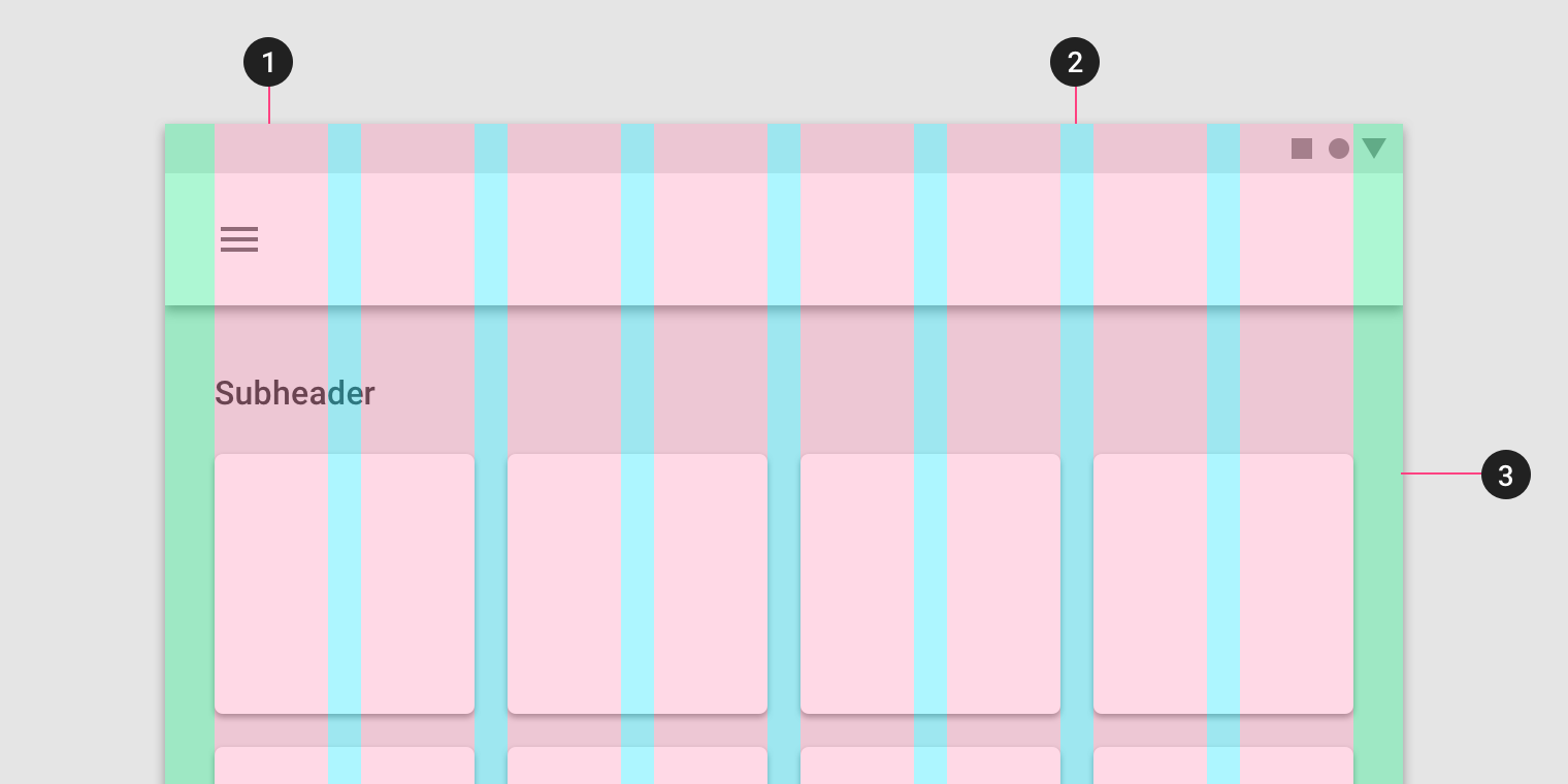
1. Columns
2. Gutters
3. Margins
Columns
Content is placed in the areas of the screen that contain columns. Column width is defined using percentages, rather than fixed values, to allow content...
Content is placed in the areas of the screen that contain columns.
コンテンツは、列を含む画面の領域に配置されます。
Column width is defined using percentages, rather than fixed values, to allow content to flexibly adapt to any screen size. The number of columns displayed in the grid is determined by the breakpoint range (a range of predetermined screen sizes) at which a screen is viewed, whether it’s a breakpoint for mobile, tablet, or another size.
列幅は、固定値ではなくパーセンテージを使用して定義され、コンテンツを任意の画面サイズに柔軟に適応させることができます。 グリッドに表示される列の数は、モバイル、タブレット、または別のサイズのブレークポイントのいずれであっても、画面が表示されるブレークポイント範囲(所定の画面サイズの範囲)によって決まります。
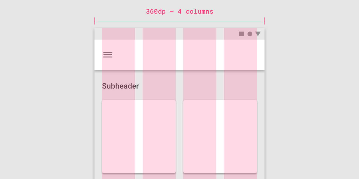
On mobile, at a breakpoint of 360dp, this layout grid uses 4 columns.
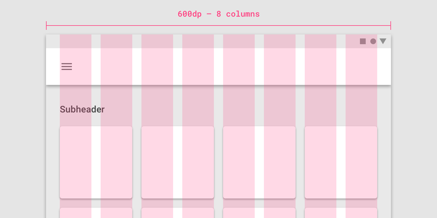
On tablet, at a breakpoint of 600dp, this layout grid uses 8 columns.
Gutters
ガター
Gutters are the spaces between columns. They help separate content. Gutter widths are fixed values at each breakpoint range. To better adapt to the screen,...
Gutters are the spaces between columns. They help separate content.
溝は列の間のスペースです。 コンテントを区分けるものです。
Gutter widths are fixed values at each breakpoint range. To better adapt to the screen, gutter width can change at different breakpoints. Wider gutters are more appropriate for larger screens, as they create more whitespace between columns.
ガター幅は、各ブレークポイントの範囲で固定値です。 画面にうまく適応するために、ガター幅は異なるブレークポイントで変更できます。 列間に空白が多くなるほど、より大きなスクリーンに対してはより広い溝が適しています。
On mobile, at a breakpoint of 360dp, this layout grid uses 16dp gutters.
On tablet, at a breakpoint of 600dp, this layout grid uses 24dp gutters.
Margins
マージン
Margins are the space between content and the left and right edges of the screen. Margin widths are defined as fixed values at each breakpoint...
Margins are the space between content and the left and right edges of the screen.
マージンは、コンテンツと画面の左右の端の間のスペースです。
Margin widths are defined as fixed values at each breakpoint range. To better adapt to the screen, the margin width can change at different breakpoints. Wider margins are more appropriate for larger screens, as they create more whitespace around the perimeter of content.
マージン幅は、各ブレークポイント範囲で固定値として定義されます。 画面にうまく適応するには、異なるブレークポイントでマージンの幅を変更することができます。 大画面では、コンテンツの周りに空白が多くなるため、マージンが広い方が適しています。

On mobile, at a breakpoint of 360dp, this layout grid uses 16dp margins.
モバイルでは、360dpのブレークポイントで、このレイアウトグリッドは16dpのマージンを使用します。

On a small tablet, at a breakpoint of 600dp, this layout grid uses 24dp margins.
小さなタブレットでは、600dpのブレークポイントで、このレイアウトグリッドは24dpのマージンを使用します。
Grid customization
グリッドのカスタマイズ
The layout grid can be adjusted to meet the needs of both your product and various device sizes.
レイアウトグリッドは、製品とさまざまなデバイスサイズの両方のニーズに合わせて調整することができます。
Customizing gutters
ガターのカスタマイズ
Gutters can be adjusted to create more or less space between the columns of a layout.
Gutters can be adjusted to create more or less space between the columns of a layout.
ガターは、レイアウトの列間に多少のスペースを作成するように調整することができます。
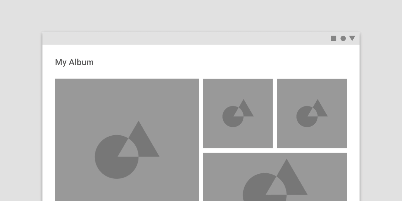
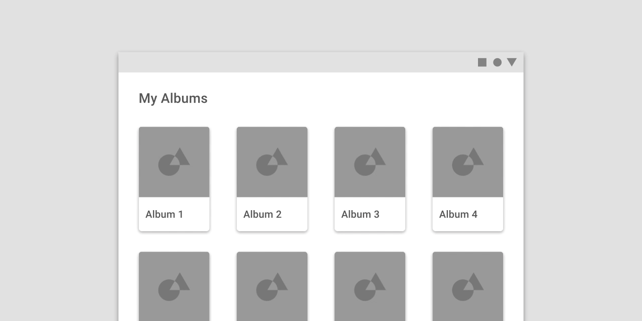
This layout grid uses 8dp gutters. The tighter spacing may suggest the images are closely related to one another, so that they are perceived as part of a collection.
このレイアウトグリッドは8dpの溝を使用します。 より狭い間隔は、画像が互いに密接に関連していることを示唆することができ、その結果、これらの画像はコレクションの一部として認識される。
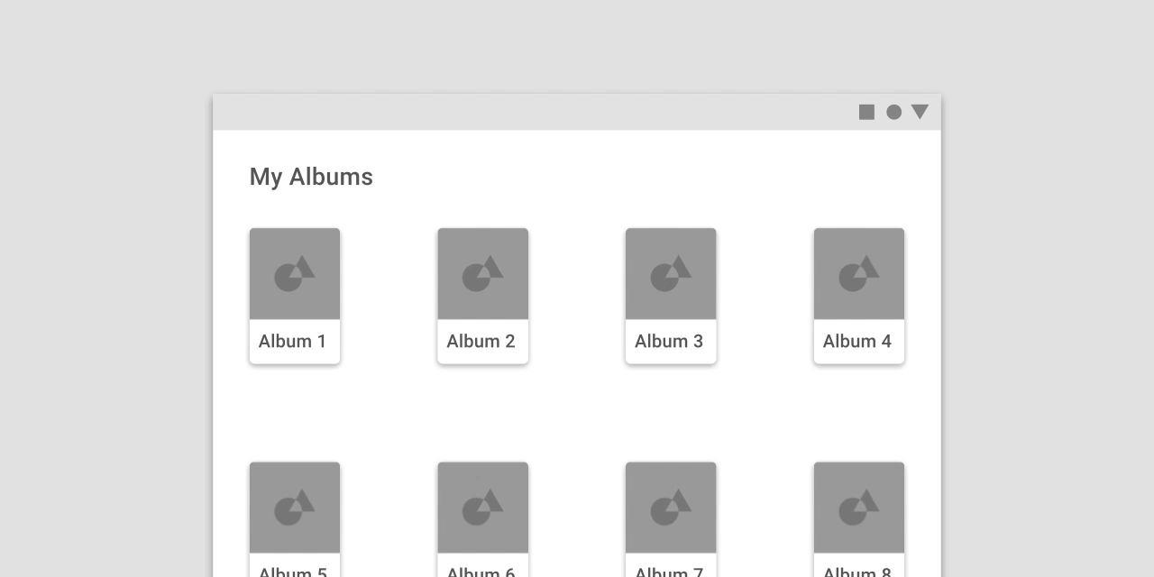
This layout grid uses larger, 32dp gutters to create more separation between columns. The extra space helps each album to be perceived as an individual entity within a collection.
このレイアウトグリッドは、より大きい32dpの溝を使用して列間の間隔を広げます。 余分なスペースは、各アルバムがコレクション内の個々のエンティティとして認識されるのを助けます。
Don’t.
Don’t make gutters too large, such as the same width as the columns. Too much space doesn’t leave enough room for content and prevents it from appearing unified.
列と同じ幅のように溝が大きすぎないようにしてください。 スペースが多すぎるとコンテンツのための十分なスペースが確保されず、統合されて表示されなくなります。
Customizing margins
マージンのカスタマイズ
Margins can be adjusted to create more or less space between content and the edge of the screen. Margins use a fixed value for each...
Margins can be adjusted to create more or less space between content and the edge of the screen. Margins use a fixed value for each breakpoint.
マージンを調整して、コンテンツと画面の端の間に多少のスペースを作成することができます。 マージンはブレークポイントごとに固定値を使用します。
The ideal length for legibility of body copy is 40-60 characters per line.
本文コピーの読みやすさの理想的な長さは、1行につき40〜60文字です。
This layout grid uses small, 8dp margins to allow images to take up more space in the layout.
このレイアウトグリッドでは、8dpの小さいマージンを使用して、イメージがレイアウト内でより多くのスペースを取ることができます。

This layout grid uses large, 64dp margins to limit the width of content.
このレイアウトグリッドでは、コンテンツの幅を制限するために大きな64dpの余白が使用されます。

Don’t.
Don’t make margins so large that there isn’t sufficient room for content.
マージンをあまり大きくしないでください。コンテンツに十分な余裕がありません。
Gutters and margins
ガターとマージン
Within the same breakpoint, gutter and margin widths can be different from one another.
Within the same breakpoint, gutter and margin widths can be different from one another.
同じブレークポイント内で、ガターとマージンの幅はお互いに異なる場合があります。
- 32dp margins
- 8dp gutters
Horizontal grids
水平グリッド
The Material Design layout grid can be customized for touch UIs that scroll horizontally. Columns, gutters, and margins are laid out from left to right,...
The Material Design layout grid can be customized for touch UIs that scroll horizontally. Columns, gutters, and margins are laid out from left to right, rather than top to bottom. The height of the screen determines the number of columns in a horizontal grid.
マテリアルデザインレイアウトグリッドは、水平にスクロールするタッチUI用にカスタマイズできます。 列、溝、および余白は、上から下へではなく、左から右に配置されます。 画面の高さによって、水平グリッド内の列の数が決まります。
Horizontally scrolling UIs are uncommon on non-touch and web platforms.
水平にスクロールするUIは、非タッチおよびウェブプラットフォームでは珍しいことです。
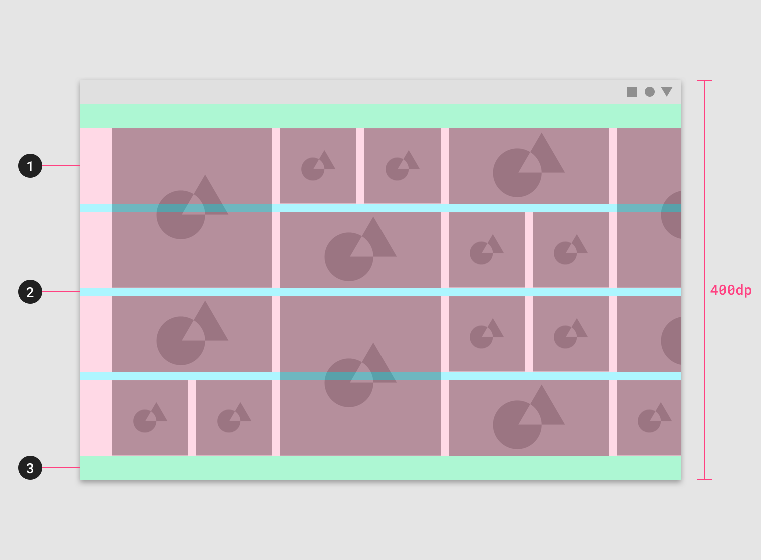
This horizontal layout grid uses four horizontal columns, for a total layout height of 400dp.
この水平レイアウトグリッドは、4つの水平カラムを使用し、合計レイアウトの高さは400dpです。
- Columns
- Gutters
- Margins
Horizontal grids can be positioned to accommodate different heights, allowing space for app bars or other UI regions at the top.
水平グリッドは、異なる高さに対応するように配置することができ、上部にアプリバーやその他のUI領域のスペースを確保できます。
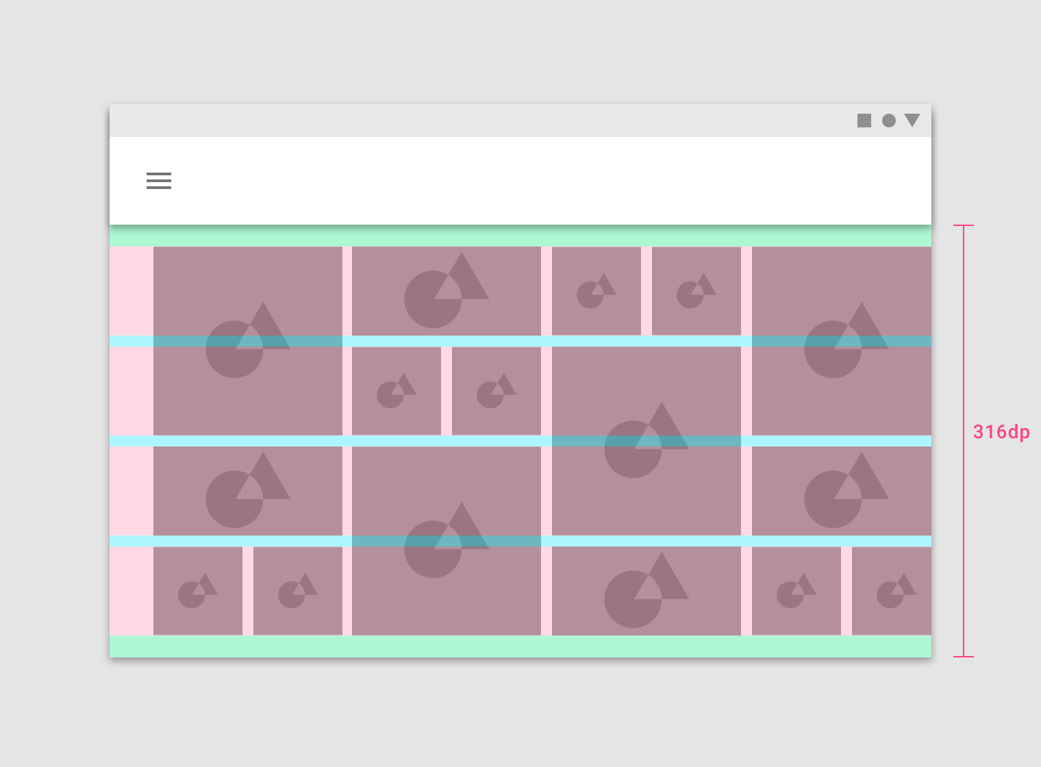
This horizontal layout grid starts below the Top App Bar component and uses four horizontal columns at a height of 316dp.
この水平レイアウトグリッドは、トップアプリケーションバーコンポーネントの下から始まり、高さ316dpの4本の水平な列を使用します。
Breakpoints
ブレイクポイント
Breakpoint system
ブレークポイントシステム
Material Design provides responsive layouts based on the following column structures. Layouts using 4-column, 8-column, and 12-column grids are available for use across different screens,...
Material Design provides responsive layouts based on the following column structures. Layouts using 4-column, 8-column, and 12-column grids are available for use across different screens, devices, and orientations.
マテリアルデザインは、以下の列構造に基づいて反応性の高いレイアウトを提供します。 4列、8列、12列のグリッドを使用するレイアウトは、さまざまな画面、デバイス、および向きで使用できます。
Each breakpoint range determines the number of columns, and recommended margins and gutters, for each display size.
各ブレークポイントの範囲によって、各ディスプレイサイズに対する列の数、推奨されるマージン、および溝が決まります。
|
Breakpoint Range (dp) |
Portrait |
Landscape |
Window |
Columns |
Margins / Gutters* |
|
0 – 359 |
small handset |
xsmall |
4 |
16 |
|
|
360 – 399 |
medium handset |
xsmall |
4 |
16 |
|
|
400 – 479 |
large handset |
xsmall |
4 |
16 |
|
|
480 – 599 |
large handset |
small handset |
xsmall |
4 |
16 |
|
600 – 719 |
small tablet |
medium handset |
small |
8 |
16 |
|
720 – 839 |
large tablet |
large handset |
small |
8 |
24 |
|
840 – 959 |
large tablet |
large handset |
small |
12 |
24 |
|
960 – 1023 |
small tablet |
small |
12 |
24 |
|
|
1024 – 1279 |
large tablet |
medium |
12 |
24 |
|
|
1280 – 1439 |
large tablet |
medium |
12 |
24 |
|
|
1440 – 1599 |
large |
12 |
24 |
||
|
1600 – 1919 |
large |
12 |
24 |
||
|
1920 + |
xlarge |
12 |
24 |
*Margins and gutters are flexible and don’t need to be of equal size.
マージンと溝は柔軟で、同じサイズである必要はありません。
The following column numbers, and margin and gutter widths, apply to breakpoints for screens, devices, orientations, and widths on iOS. Device Orientation Vertical Size Category...
The following column numbers, and margin and gutter widths, apply to breakpoints for screens, devices, orientations, and widths on iOS.
iOSの画面、デバイス、向き、幅のブレークポイントには、次の列番号と余白と溝の幅が適用されます。
|
Device |
Orientation |
Vertical Size Category |
Horizontal Size Category |
Columns |
Margins/ Gutters* |
|
Portrait |
Regular |
Compact |
4 |
16 |
|
|
Landscape |
Compact |
Compact |
4 |
16 |
|
|
iPhone Plus |
Portrait |
Regular |
Compact |
4 |
16 |
|
iPhone Plus |
Landscape |
Compact |
Regular |
4 |
16 |
|
Portrait |
Regular |
Regular |
8 |
16 |
|
|
Landscape |
Regular |
Regular |
8 |
24 |
|
|
iPad - Even Split Multitasking |
Portrait |
Regular |
Compact |
12 |
24 |
|
iPad - Even Split Multitasking |
Landscape |
Regular |
Compact |
12 |
24 |
|
iPad - 2/3 Split Multitasking |
Portrait |
Regular |
Compact |
12 |
24 |
|
iPad - 2/3 Split Multitasking - First App |
Landscape |
Regular |
Regular |
12 |
24 |
|
iPad - 2/3 Split Multitasking - Second App |
Landscape |
Regular |
Compact |
12 |
24 |
|
iPad Pro - Even Split Multitasking |
Portrait |
Regular |
Compact |
12 |
24 |
|
iPad Pro 13in - Even Split Multitasking |
Landscape |
Regular |
Regular |
12 |
24 |
*Margins and gutters are flexible values and don’t need to be equal within the Material Design grid system.
マージンと溝は柔軟な値であり、マテリアルデザイングリッドシステム内では同じである必要はありません。
Grid behavior
グリッドの動作
Fluid grids
流体グリッド
Fluid grids use columns that scale and resize content. A fluid grid’s layout can use breakpoints to determine if the layout needs to change dramatically.
Fluid grids use columns that scale and resize content. A fluid grid’s layout can use breakpoints to determine if the layout needs to change dramatically.
流体グリッドは、コンテンツの拡大縮小やサイズ変更を行う列を使用します。 流体グリッドのレイアウトでは、ブレークポイントを使用して、レイアウトを大幅に変更する必要があるかどうかを判断できます。
Columns expanding in a full-width grid
Fixed grids
固定グリッド
Fixed grids use columns of a fixed size, with fluid margins to keep content unchanging within each breakpoint range. A fixed grid’s layout can only...
Fixed grids use columns of a fixed size, with fluid margins to keep content unchanging within each breakpoint range. A fixed grid’s layout can only change at an assigned breakpoint.
固定グリッドは、一定のサイズの列を使用し、流体マージンを使用して、各ブレークポイント範囲内で内容を変更しないようにします。 固定グリッドのレイアウトは、割り当てられたブレークポイントでのみ変更できます。
Margins expanding in a fixed grid
UI regions
UIリージョン
A layout is made up of several UI regions, such as side navigation, content areas, and app bars. These regions can display actions, content, or navigation destinations. UI regions should be consistent across devices, while adapting to different breakpoints of different screen sizes.
レイアウトは、サイドナビゲーション、コンテンツ領域、アプリケーションバーなどのいくつかのUI領域で構成されています。 これらのリージョンは、アクション、コンテンツ、またはナビゲーションの宛先を表示できます。 UIリージョンは、さまざまな画面サイズの異なるブレークポイントに適応しながら、デバイス間で一貫している必要があります。
To increase familiarity across devices, UI elements designed for desktop should be organized in a way that’s consistent with the mobile UI.
デバイス間の親密性を高めるには、デスクトップ用に設計されたUI要素をモバイルUIと一貫性のある方法で整理する必要があります。
Layout changes on different-sized screens
Permanent UI regions
不変のUI領域
Permanent UI regions are regions that can be displayed outside of the responsive grid, like a navigation drawer. These regions cannot be collapsed.
Permanent UI regions are regions that can be displayed outside of the responsive grid, like a navigation drawer. These regions cannot be collapsed.
永続的なUI領域は、ナビゲーションドロワのようにレスポンスグリッドの外側に表示できる領域です。 これらの領域は折りたたむことができません。

When screen space is available, a permanent UI region exposes content.
画面領域が利用可能な場合は、永続UI領域がコンテンツを公開します。
Persistent UI regions
永続的なUI領域
Persistent UI regions are regions that can be displayed upon command at any time, or they can remain visible. They can be toggled on or...
Persistent UI regions are regions that can be displayed upon command at any time, or they can remain visible. They can be toggled on or off, to appear or disappear. When they appear, they condense both content and the grid.
永続的なUI領域は、いつでもコマンドで表示できる領域、または可視のままにできる領域です。 それらはオンまたはオフに切り替えたり、表示したり消えたりすることができます。 それらが現れると、コンテンツとグリッドの両方を圧縮します。
When a persistent UI region is visible, its visibility isn’t affected by interaction with other elements on screen.
永続的なUI領域が表示されている場合、その可視性は画面上の他の要素との相互作用によって影響を受けません。
When open, this persistent navigation drawer causes the grid (and its content) to condense.
開いていると、この永続的なナビゲーションドロワーはグリッド(およびそのコンテンツ)を凝縮させます。
Temporary UI regions
一時的なUI領域
Temporary UI regions appear temporarily, and when they do, they do not affect the responsive grid. When visible, they can be hidden by tapping an...
Temporary UI regions appear temporarily, and when they do, they do not affect the responsive grid. When visible, they can be hidden by tapping an item in their region, or any space outside their region.
一時的なUI領域は一時的に表示され、応答グリッドには影響しません。 表示されている場合は、その地域のアイテム、または地域外のアイテムをタップして非表示にすることができます。
When a UI region is visible, other screen elements aren’t interactive.
UI領域が表示されている場合、他の画面要素は対話的ではありません。

When open, this temporary navigation drawer doesn’t affect the responsive grid or screen content.
開いている場合、この一時ナビゲーション・ドロワーは応答グリッドまたは画面の内容に影響しません。
Whiteframes
ホワイトフレーム
Whiteframes are structured layouts that provide a consistent approach to layout, layering, and shadows. They are a starting point, meant to be modified to meet the specific needs of a product.
ホワイトフレームは、レイアウト、レイヤー、およびシャドウに対する一貫したアプローチを提供する構造化レイアウトです。 それらは出発点であり、製品の特定のニーズを満たすために修正されることを意図しています。
1. Mobile
2. Desktop
1. Mobile
2. Desktop
Understanding layout
Understanding layout
レイアウトの理解
Material Design layouts encourage consistency across platforms, environments, and screen sizes by using uniform elements and spacing.
マテリアルデザインのレイアウトは、均一な要素と間隔を使用して、プラットフォーム、環境、および画面サイズの一貫性を促進します。
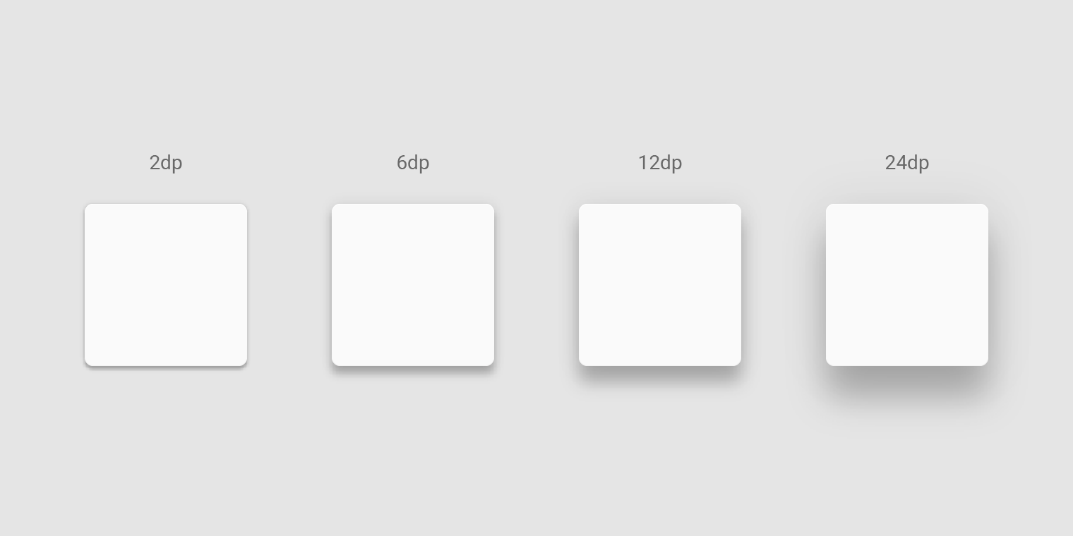
Light and shadows
Material surfaces cast shadows when they obstruct light sources.
マテリアルサーフィスは、光源を遮ると影を投げかけます。
Light
Light and shadows
光と影
In the Material Design environment, virtual lights illuminate the UI. Key lights create sharper, directional shadows, called key shadows. Ambient light appears from all angles...
In the Material Design environment, virtual lights illuminate the UI. Key lights create sharper, directional shadows, called key shadows. Ambient light appears from all angles to create diffused, soft shadows, called ambient shadows.
マテリアルデザイン環境では、バーチャルライトがUIを照らします。 キーライトは、キーシャドウと呼ばれるシャープな、方向をもったシャドウを作成します。 アンビエントライトは、アンビエントシャドウと呼ばれる拡散した柔らかいシャドウを作成するために、すべての角度から表示されます。

Shadow cast by a key light
キーライトで陰影をキャスト

Shadow cast by ambient light
環境光による影のキャスト
Combined shadow from key and ambient lights
キーとアンビエントライトの組み合わせ

Elements use shadows on dark surfaces, even if they are less visible.
要素は、暗い面に対しても影を落とします。目立たなかったとしても。
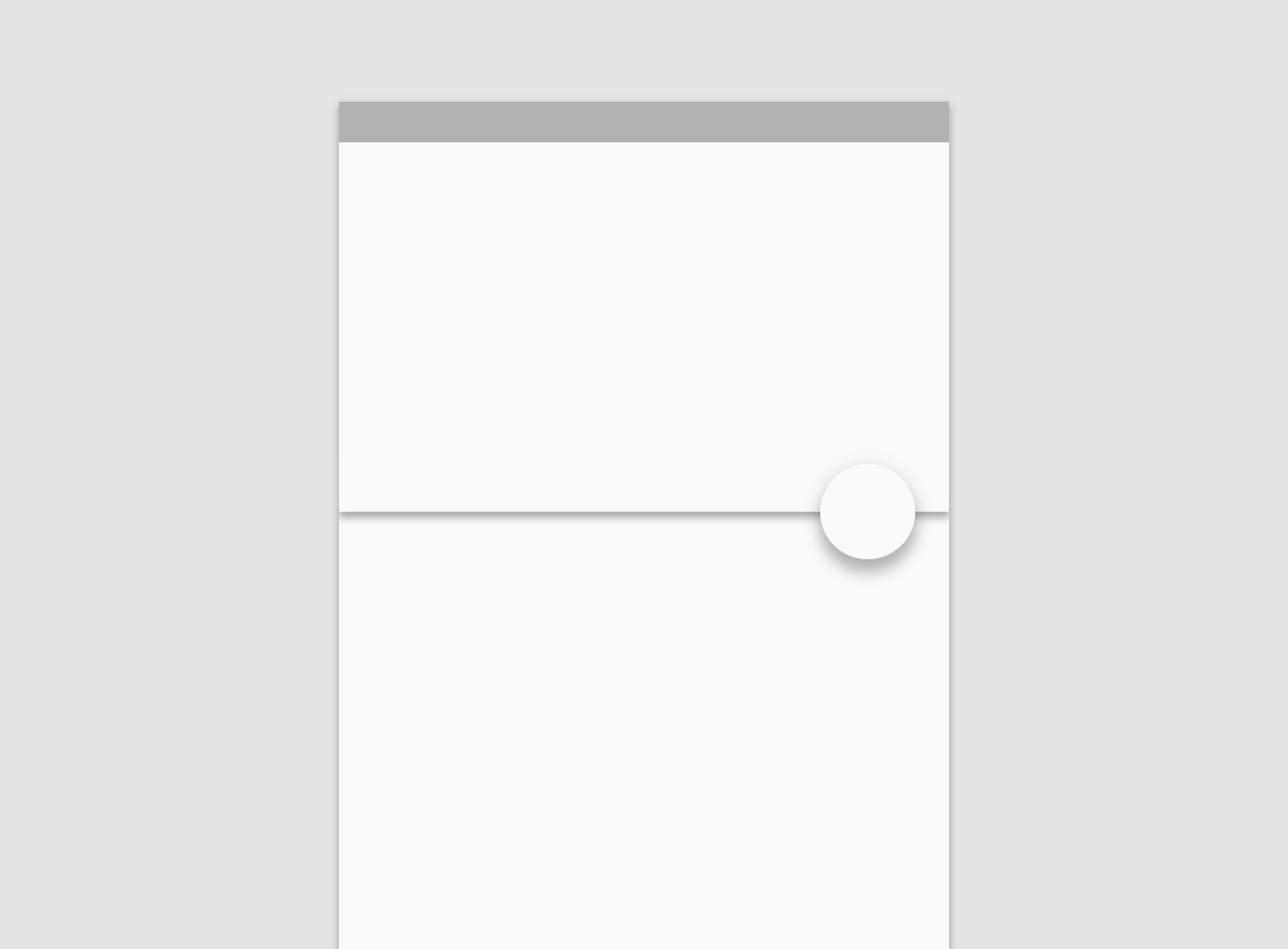
Light sources
光源
Shadows in the Material environment are cast by a key light and ambient light. In Android and iOS development, shadows occur when light sources are...
Shadows in the Material environment are cast by a key light and ambient light. In Android and iOS development, shadows occur when light sources are blocked by Material surfaces at various positions along the z-axis. On the web, shadows are depicted by manipulating the y-axis only. The following example shows a card with an elevation of 6dp.
マテリアル環境の影は、キーライトとアンビエントライトによってキャストされます。 AndroidおよびiOS開発では、光源がz軸に沿ったさまざまな位置でマテリアルサーフェスによってブロックされると影が発生します。 ウェブ上では、影はy軸だけを操作することによって描かれています。 次の例は、標高が6dpのカードを示しています。

Don’t.
Shadow cast by key light
Don’t.
Shadow cast by ambient light

Do.
Combined shadow from key and ambient lights
Shadows
影
Usage
使用法
Because shadows express the degree of elevation between surfaces, they must be used consistently throughout your product.
Because shadows express the degree of elevation between surfaces, they must be used consistently throughout your product.
シャドウはサーフェス間の高さの程度を表すため、製品全体で一貫して使用する必要があります。
Elevation is depicted by consistent use of shadow.
標高は、一貫した影の使用によって表されます。
Shadow size reflects elevation. Surfaces at higher elevations have larger shadows, while those at lower elevations have smaller shadows.
影の大きさは標高を反映します。 より高い隆起部の表面はより大きな影を有し、より低い隆起部の表面はより小さい影を有する。
Caution.
If your product doesn’t use shadows, convey elevation in other ways, such as through parallax motion.
プロダクトが影を使用しない場合は、視差の動きなど、他の方法で標高を伝えます。
Do.
The appearance of a shadow indicates the list item has been picked up and can move in front of its peers during this reorder interaction.
シャドウの外観は、リスト項目が選択されたことを示し、この並べ替えの相互作用中にピアの前に移動することができます。
Shadows & Motion
影と動き
Shadows provide useful cues about an surface’s direction of movement and whether the distance between surfaces is increasing or decreasing.