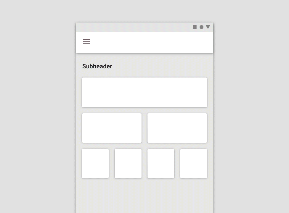
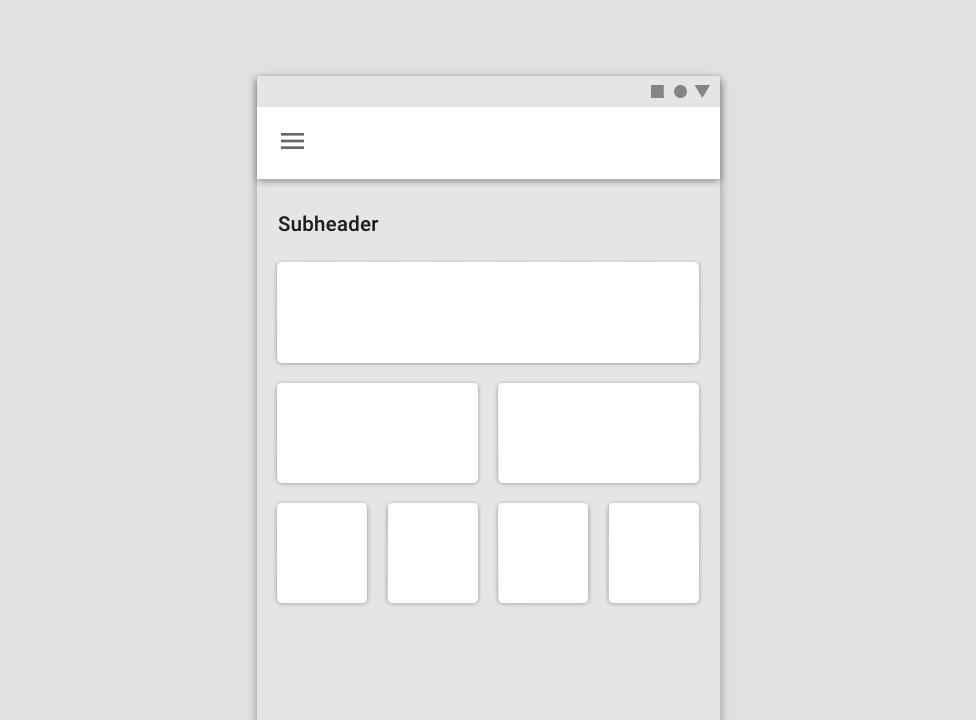
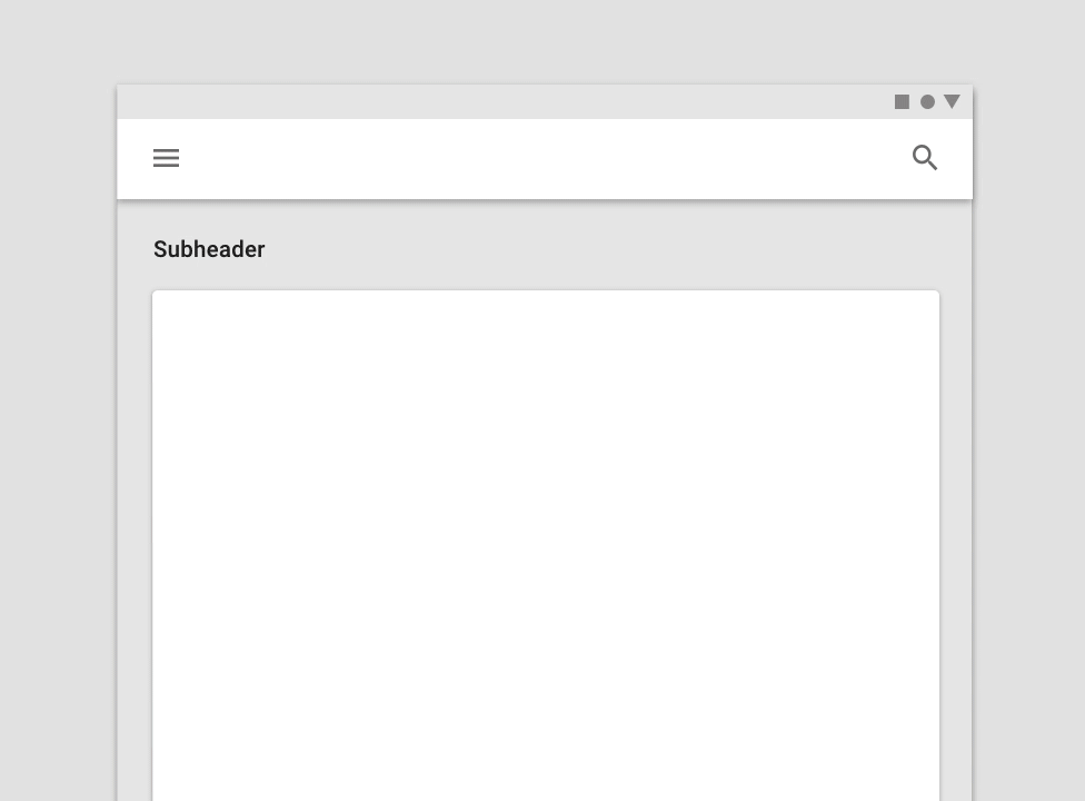
Responsive layout grid
Responsive layout grid
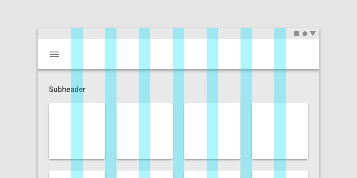
The Material Design responsive layout grid adapts to screen size and orientation, ensuring consistency across layouts.
マテリアルデザインに対応したレイアウトグリッドは、画面のサイズと向きに適応し、レイアウト全体の一貫性を保証します。
Columns, gutters, and margins
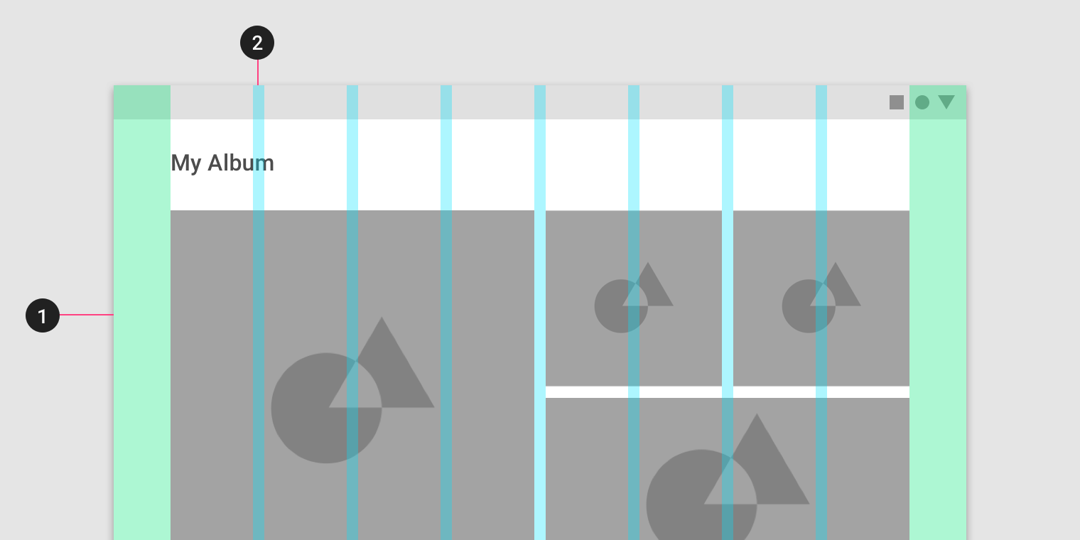
The Material Design layout grid is made up of three elements: columns, gutters, and margins.
マテリアルデザインレイアウトグリッドは、列、溝、およびマージンの3つの要素で構成されています。
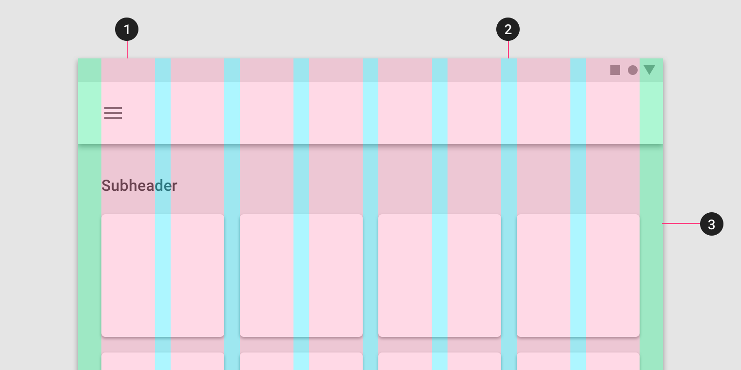
1. Columns
2. Gutters
3. Margins
Columns
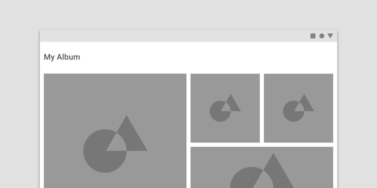
Content is placed in the areas of the screen that contain columns. Column width is defined using percentages, rather than fixed values, to allow content...
Content is placed in the areas of the screen that contain columns.
コンテンツは、列を含む画面の領域に配置されます。
Column width is defined using percentages, rather than fixed values, to allow content to flexibly adapt to any screen size. The number of columns displayed in the grid is determined by the breakpoint range (a range of predetermined screen sizes) at which a screen is viewed, whether it’s a breakpoint for mobile, tablet, or another size.
列幅は、固定値ではなくパーセンテージを使用して定義され、コンテンツを任意の画面サイズに柔軟に適応させることができます。 グリッドに表示される列の数は、モバイル、タブレット、または別のサイズのブレークポイントのいずれであっても、画面が表示されるブレークポイント範囲(所定の画面サイズの範囲)によって決まります。
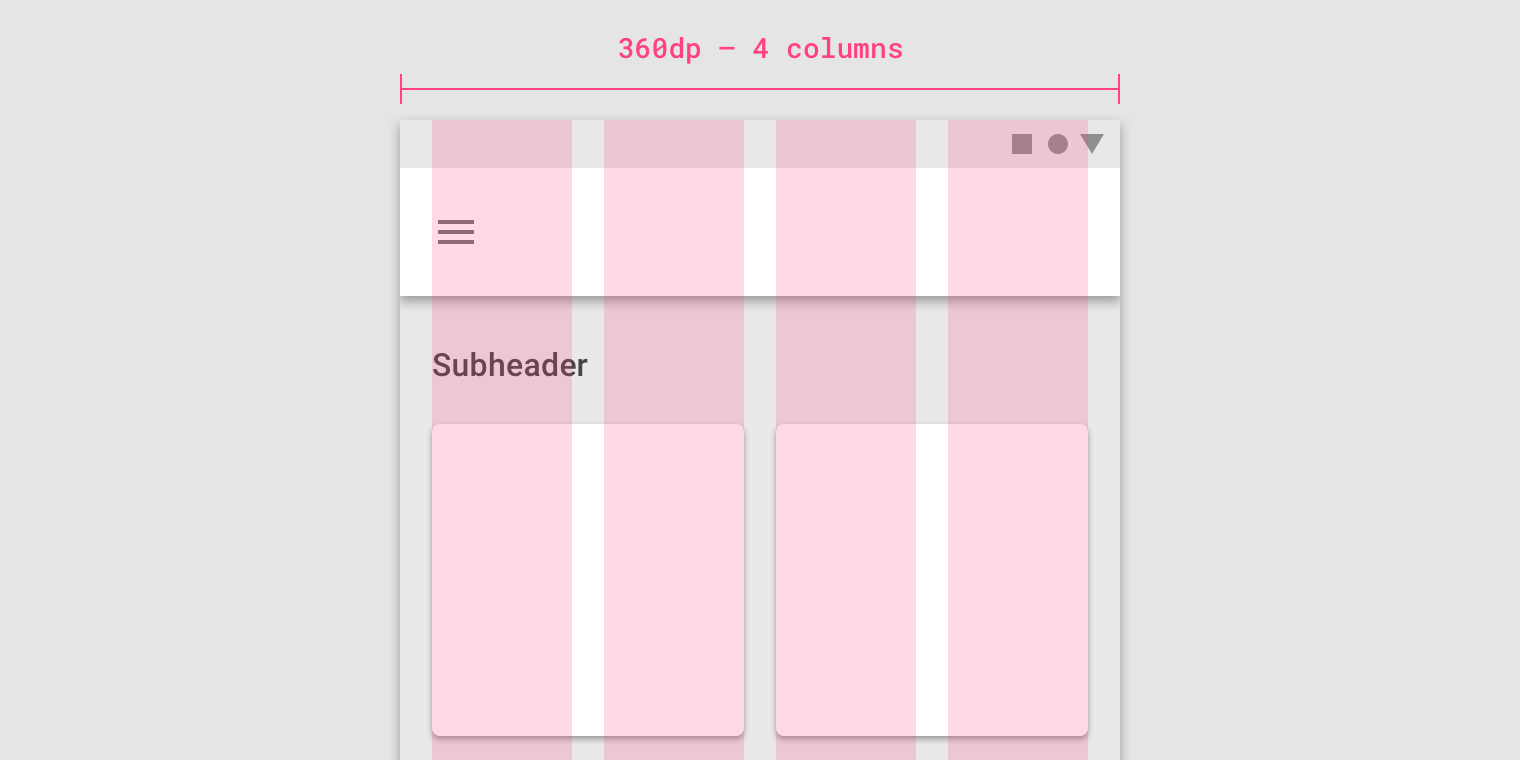
On mobile, at a breakpoint of 360dp, this layout grid uses 4 columns.
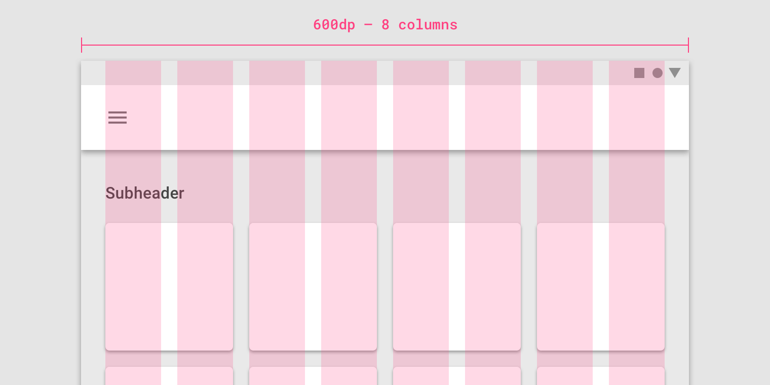
On tablet, at a breakpoint of 600dp, this layout grid uses 8 columns.
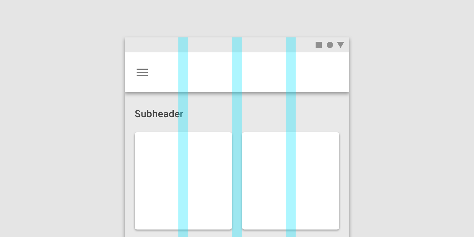
Gutters
ガター
Gutters are the spaces between columns. They help separate content. Gutter widths are fixed values at each breakpoint range. To better adapt to the screen,...
Gutters are the spaces between columns. They help separate content.
溝は列の間のスペースです。 コンテントを区分けるものです。
Gutter widths are fixed values at each breakpoint range. To better adapt to the screen, gutter width can change at different breakpoints. Wider gutters are more appropriate for larger screens, as they create more whitespace between columns.
ガター幅は、各ブレークポイントの範囲で固定値です。 画面にうまく適応するために、ガター幅は異なるブレークポイントで変更できます。 列間に空白が多くなるほど、より大きなスクリーンに対してはより広い溝が適しています。
On mobile, at a breakpoint of 360dp, this layout grid uses 16dp gutters.
On tablet, at a breakpoint of 600dp, this layout grid uses 24dp gutters.
Margins
マージン
Margins are the space between content and the left and right edges of the screen. Margin widths are defined as fixed values at each breakpoint...
Margins are the space between content and the left and right edges of the screen.
マージンは、コンテンツと画面の左右の端の間のスペースです。
Margin widths are defined as fixed values at each breakpoint range. To better adapt to the screen, the margin width can change at different breakpoints. Wider margins are more appropriate for larger screens, as they create more whitespace around the perimeter of content.
マージン幅は、各ブレークポイント範囲で固定値として定義されます。 画面にうまく適応するには、異なるブレークポイントでマージンの幅を変更することができます。 大画面では、コンテンツの周りに空白が多くなるため、マージンが広い方が適しています。

On mobile, at a breakpoint of 360dp, this layout grid uses 16dp margins.
モバイルでは、360dpのブレークポイントで、このレイアウトグリッドは16dpのマージンを使用します。

On a small tablet, at a breakpoint of 600dp, this layout grid uses 24dp margins.
小さなタブレットでは、600dpのブレークポイントで、このレイアウトグリッドは24dpのマージンを使用します。
Grid customization
グリッドのカスタマイズ
The layout grid can be adjusted to meet the needs of both your product and various device sizes.
レイアウトグリッドは、製品とさまざまなデバイスサイズの両方のニーズに合わせて調整することができます。
Customizing gutters
ガターのカスタマイズ
Gutters can be adjusted to create more or less space between the columns of a layout.
Gutters can be adjusted to create more or less space between the columns of a layout.
ガターは、レイアウトの列間に多少のスペースを作成するように調整することができます。
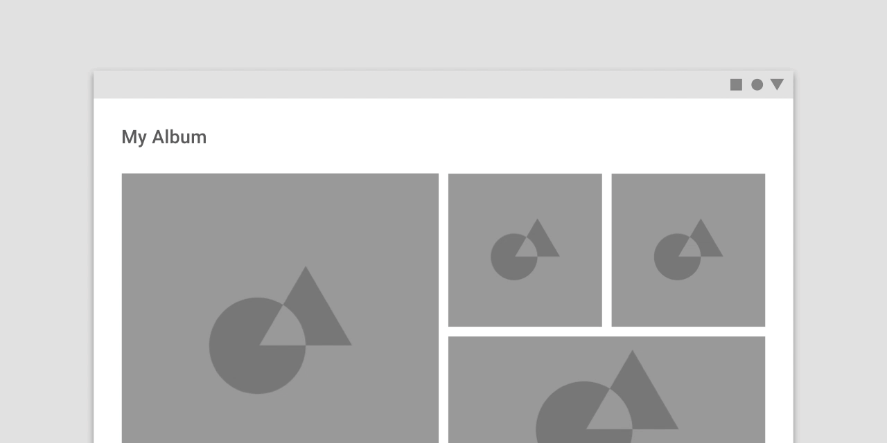
This layout grid uses 8dp gutters. The tighter spacing may suggest the images are closely related to one another, so that they are perceived as part of a collection.
このレイアウトグリッドは8dpの溝を使用します。 より狭い間隔は、画像が互いに密接に関連していることを示唆することができ、その結果、これらの画像はコレクションの一部として認識される。
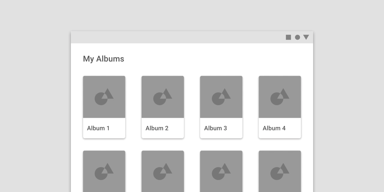
This layout grid uses larger, 32dp gutters to create more separation between columns. The extra space helps each album to be perceived as an individual entity within a collection.
このレイアウトグリッドは、より大きい32dpの溝を使用して列間の間隔を広げます。 余分なスペースは、各アルバムがコレクション内の個々のエンティティとして認識されるのを助けます。
Don’t.
Don’t make gutters too large, such as the same width as the columns. Too much space doesn’t leave enough room for content and prevents it from appearing unified.
列と同じ幅のように溝が大きすぎないようにしてください。 スペースが多すぎるとコンテンツのための十分なスペースが確保されず、統合されて表示されなくなります。
Customizing margins
マージンのカスタマイズ
Margins can be adjusted to create more or less space between content and the edge of the screen. Margins use a fixed value for each...
Margins can be adjusted to create more or less space between content and the edge of the screen. Margins use a fixed value for each breakpoint.
マージンを調整して、コンテンツと画面の端の間に多少のスペースを作成することができます。 マージンはブレークポイントごとに固定値を使用します。
The ideal length for legibility of body copy is 40-60 characters per line.
本文コピーの読みやすさの理想的な長さは、1行につき40〜60文字です。
This layout grid uses small, 8dp margins to allow images to take up more space in the layout.
このレイアウトグリッドでは、8dpの小さいマージンを使用して、イメージがレイアウト内でより多くのスペースを取ることができます。

This layout grid uses large, 64dp margins to limit the width of content.
このレイアウトグリッドでは、コンテンツの幅を制限するために大きな64dpの余白が使用されます。

Don’t.
Don’t make margins so large that there isn’t sufficient room for content.
マージンをあまり大きくしないでください。コンテンツに十分な余裕がありません。
Gutters and margins
ガターとマージン
Within the same breakpoint, gutter and margin widths can be different from one another.
Within the same breakpoint, gutter and margin widths can be different from one another.
同じブレークポイント内で、ガターとマージンの幅はお互いに異なる場合があります。
- 32dp margins
- 8dp gutters
Horizontal grids
水平グリッド
The Material Design layout grid can be customized for touch UIs that scroll horizontally. Columns, gutters, and margins are laid out from left to right,...
The Material Design layout grid can be customized for touch UIs that scroll horizontally. Columns, gutters, and margins are laid out from left to right, rather than top to bottom. The height of the screen determines the number of columns in a horizontal grid.
マテリアルデザインレイアウトグリッドは、水平にスクロールするタッチUI用にカスタマイズできます。 列、溝、および余白は、上から下へではなく、左から右に配置されます。 画面の高さによって、水平グリッド内の列の数が決まります。
Horizontally scrolling UIs are uncommon on non-touch and web platforms.
水平にスクロールするUIは、非タッチおよびウェブプラットフォームでは珍しいことです。
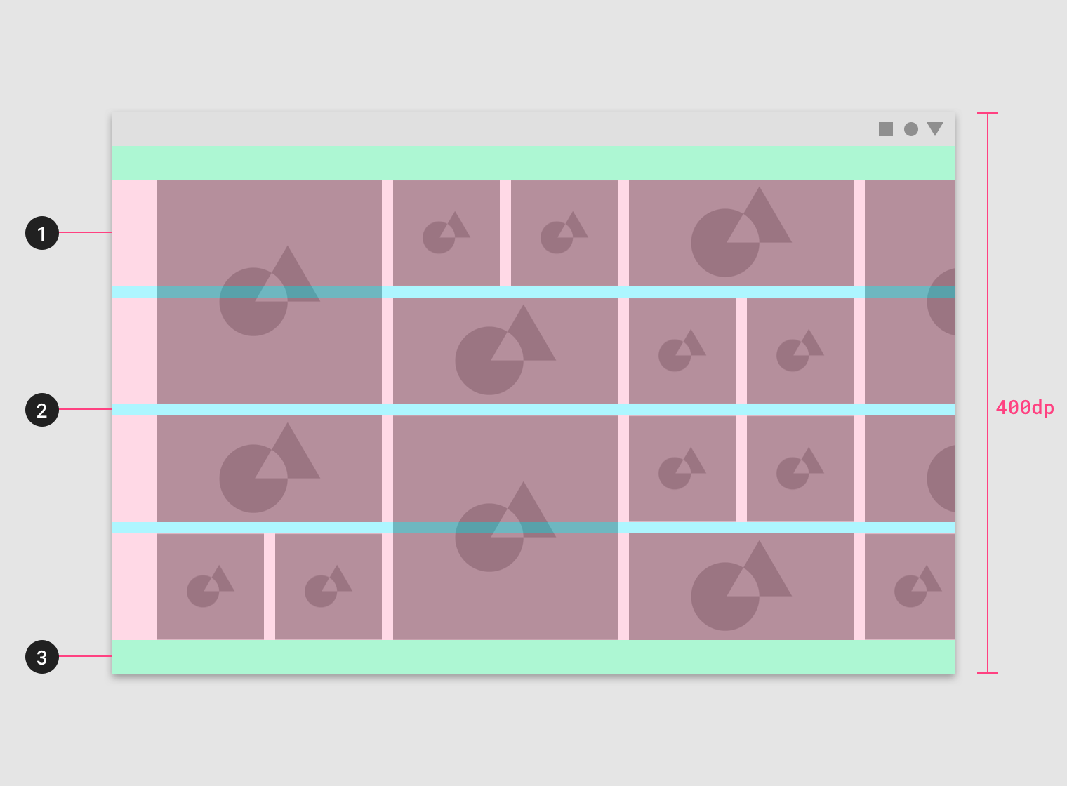
This horizontal layout grid uses four horizontal columns, for a total layout height of 400dp.
この水平レイアウトグリッドは、4つの水平カラムを使用し、合計レイアウトの高さは400dpです。
- Columns
- Gutters
- Margins
Horizontal grids can be positioned to accommodate different heights, allowing space for app bars or other UI regions at the top.
水平グリッドは、異なる高さに対応するように配置することができ、上部にアプリバーやその他のUI領域のスペースを確保できます。
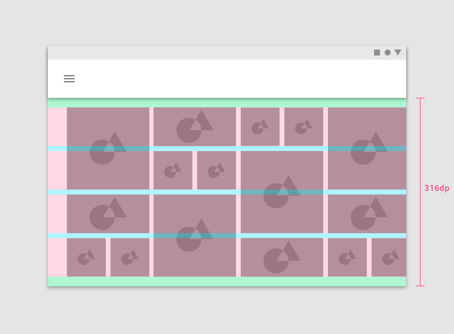
This horizontal layout grid starts below the Top App Bar component and uses four horizontal columns at a height of 316dp.
この水平レイアウトグリッドは、トップアプリケーションバーコンポーネントの下から始まり、高さ316dpの4本の水平な列を使用します。
Breakpoints
ブレイクポイント
Breakpoint system
ブレークポイントシステム
Material Design provides responsive layouts based on the following column structures. Layouts using 4-column, 8-column, and 12-column grids are available for use across different screens,...
Material Design provides responsive layouts based on the following column structures. Layouts using 4-column, 8-column, and 12-column grids are available for use across different screens, devices, and orientations.
マテリアルデザインは、以下の列構造に基づいて反応性の高いレイアウトを提供します。 4列、8列、12列のグリッドを使用するレイアウトは、さまざまな画面、デバイス、および向きで使用できます。
Each breakpoint range determines the number of columns, and recommended margins and gutters, for each display size.
各ブレークポイントの範囲によって、各ディスプレイサイズに対する列の数、推奨されるマージン、および溝が決まります。
|
Breakpoint Range (dp) |
Portrait |
Landscape |
Window |
Columns |
Margins / Gutters* |
|
0 – 359 |
small handset |
xsmall |
4 |
16 |
|
|
360 – 399 |
medium handset |
xsmall |
4 |
16 |
|
|
400 – 479 |
large handset |
xsmall |
4 |
16 |
|
|
480 – 599 |
large handset |
small handset |
xsmall |
4 |
16 |
|
600 – 719 |
small tablet |
medium handset |
small |
8 |
16 |
|
720 – 839 |
large tablet |
large handset |
small |
8 |
24 |
|
840 – 959 |
large tablet |
large handset |
small |
12 |
24 |
|
960 – 1023 |
small tablet |
small |
12 |
24 |
|
|
1024 – 1279 |
large tablet |
medium |
12 |
24 |
|
|
1280 – 1439 |
large tablet |
medium |
12 |
24 |
|
|
1440 – 1599 |
large |
12 |
24 |
||
|
1600 – 1919 |
large |
12 |
24 |
||
|
1920 + |
xlarge |
12 |
24 |
*Margins and gutters are flexible and don’t need to be of equal size.
マージンと溝は柔軟で、同じサイズである必要はありません。
The following column numbers, and margin and gutter widths, apply to breakpoints for screens, devices, orientations, and widths on iOS. Device Orientation Vertical Size Category...
The following column numbers, and margin and gutter widths, apply to breakpoints for screens, devices, orientations, and widths on iOS.
iOSの画面、デバイス、向き、幅のブレークポイントには、次の列番号と余白と溝の幅が適用されます。
|
Device |
Orientation |
Vertical Size Category |
Horizontal Size Category |
Columns |
Margins/ Gutters* |
|
Portrait |
Regular |
Compact |
4 |
16 |
|
|
Landscape |
Compact |
Compact |
4 |
16 |
|
|
iPhone Plus |
Portrait |
Regular |
Compact |
4 |
16 |
|
iPhone Plus |
Landscape |
Compact |
Regular |
4 |
16 |
|
Portrait |
Regular |
Regular |
8 |
16 |
|
|
Landscape |
Regular |
Regular |
8 |
24 |
|
|
iPad - Even Split Multitasking |
Portrait |
Regular |
Compact |
12 |
24 |
|
iPad - Even Split Multitasking |
Landscape |
Regular |
Compact |
12 |
24 |
|
iPad - 2/3 Split Multitasking |
Portrait |
Regular |
Compact |
12 |
24 |
|
iPad - 2/3 Split Multitasking - First App |
Landscape |
Regular |
Regular |
12 |
24 |
|
iPad - 2/3 Split Multitasking - Second App |
Landscape |
Regular |
Compact |
12 |
24 |
|
iPad Pro - Even Split Multitasking |
Portrait |
Regular |
Compact |
12 |
24 |
|
iPad Pro 13in - Even Split Multitasking |
Landscape |
Regular |
Regular |
12 |
24 |
*Margins and gutters are flexible values and don’t need to be equal within the Material Design grid system.
マージンと溝は柔軟な値であり、マテリアルデザイングリッドシステム内では同じである必要はありません。
Grid behavior
グリッドの動作
Fluid grids
流体グリッド
Fluid grids use columns that scale and resize content. A fluid grid’s layout can use breakpoints to determine if the layout needs to change dramatically.
Fluid grids use columns that scale and resize content. A fluid grid’s layout can use breakpoints to determine if the layout needs to change dramatically.
流体グリッドは、コンテンツの拡大縮小やサイズ変更を行う列を使用します。 流体グリッドのレイアウトでは、ブレークポイントを使用して、レイアウトを大幅に変更する必要があるかどうかを判断できます。
Columns expanding in a full-width grid
Fixed grids
固定グリッド
Fixed grids use columns of a fixed size, with fluid margins to keep content unchanging within each breakpoint range. A fixed grid’s layout can only...
Fixed grids use columns of a fixed size, with fluid margins to keep content unchanging within each breakpoint range. A fixed grid’s layout can only change at an assigned breakpoint.
固定グリッドは、一定のサイズの列を使用し、流体マージンを使用して、各ブレークポイント範囲内で内容を変更しないようにします。 固定グリッドのレイアウトは、割り当てられたブレークポイントでのみ変更できます。
Margins expanding in a fixed grid
UI regions
UIリージョン
A layout is made up of several UI regions, such as side navigation, content areas, and app bars. These regions can display actions, content, or navigation destinations. UI regions should be consistent across devices, while adapting to different breakpoints of different screen sizes.
レイアウトは、サイドナビゲーション、コンテンツ領域、アプリケーションバーなどのいくつかのUI領域で構成されています。 これらのリージョンは、アクション、コンテンツ、またはナビゲーションの宛先を表示できます。 UIリージョンは、さまざまな画面サイズの異なるブレークポイントに適応しながら、デバイス間で一貫している必要があります。
To increase familiarity across devices, UI elements designed for desktop should be organized in a way that’s consistent with the mobile UI.
デバイス間の親密性を高めるには、デスクトップ用に設計されたUI要素をモバイルUIと一貫性のある方法で整理する必要があります。
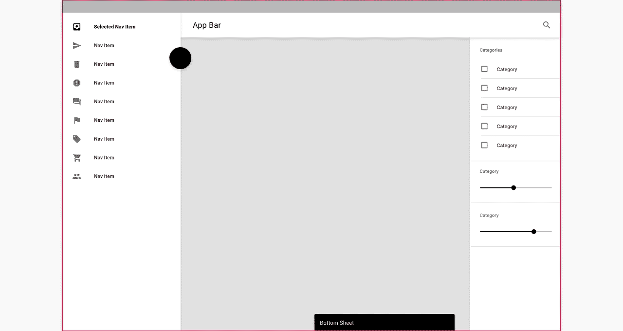
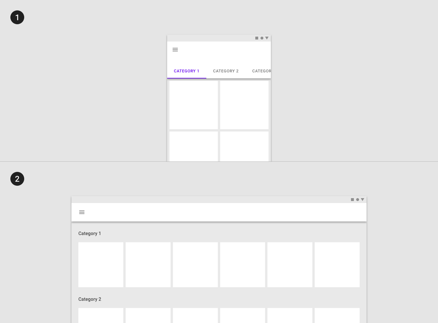
Layout changes on different-sized screens
Permanent UI regions
不変のUI領域
Permanent UI regions are regions that can be displayed outside of the responsive grid, like a navigation drawer. These regions cannot be collapsed.
Permanent UI regions are regions that can be displayed outside of the responsive grid, like a navigation drawer. These regions cannot be collapsed.
永続的なUI領域は、ナビゲーションドロワのようにレスポンスグリッドの外側に表示できる領域です。 これらの領域は折りたたむことができません。

When screen space is available, a permanent UI region exposes content.
画面領域が利用可能な場合は、永続UI領域がコンテンツを公開します。
Persistent UI regions
永続的なUI領域
Persistent UI regions are regions that can be displayed upon command at any time, or they can remain visible. They can be toggled on or...
Persistent UI regions are regions that can be displayed upon command at any time, or they can remain visible. They can be toggled on or off, to appear or disappear. When they appear, they condense both content and the grid.
永続的なUI領域は、いつでもコマンドで表示できる領域、または可視のままにできる領域です。 それらはオンまたはオフに切り替えたり、表示したり消えたりすることができます。 それらが現れると、コンテンツとグリッドの両方を圧縮します。
When a persistent UI region is visible, its visibility isn’t affected by interaction with other elements on screen.
永続的なUI領域が表示されている場合、その可視性は画面上の他の要素との相互作用によって影響を受けません。
When open, this persistent navigation drawer causes the grid (and its content) to condense.
開いていると、この永続的なナビゲーションドロワーはグリッド(およびそのコンテンツ)を凝縮させます。
Temporary UI regions
一時的なUI領域
Temporary UI regions appear temporarily, and when they do, they do not affect the responsive grid. When visible, they can be hidden by tapping an...
Temporary UI regions appear temporarily, and when they do, they do not affect the responsive grid. When visible, they can be hidden by tapping an item in their region, or any space outside their region.
一時的なUI領域は一時的に表示され、応答グリッドには影響しません。 表示されている場合は、その地域のアイテム、または地域外のアイテムをタップして非表示にすることができます。
When a UI region is visible, other screen elements aren’t interactive.
UI領域が表示されている場合、他の画面要素は対話的ではありません。

When open, this temporary navigation drawer doesn’t affect the responsive grid or screen content.
開いている場合、この一時ナビゲーション・ドロワーは応答グリッドまたは画面の内容に影響しません。
Whiteframes
ホワイトフレーム
Whiteframes are structured layouts that provide a consistent approach to layout, layering, and shadows. They are a starting point, meant to be modified to meet the specific needs of a product.
ホワイトフレームは、レイアウト、レイヤー、およびシャドウに対する一貫したアプローチを提供する構造化レイアウトです。 それらは出発点であり、製品の特定のニーズを満たすために修正されることを意図しています。
1. Mobile
2. Desktop
1. Mobile
2. Desktop