Density
Density
密度
Material Design uses low-density space by default (with large tap targets and margins) but offers high-density space when it improves the user experience.
Material Designでは、デフォルトで低密度スペースが使用されます(大きなタップターゲットとマージンがあります)が、ユーザーエクスペリエンスが向上のためには高密度スペースも使用されます。
Usage
使い方
Density principles
密度の原則
Dense UIs improve browsing and interaction with large amounts of content. Dense UIs help users focus by reducing space between actions. Density exposes more content...

Scannable
目を通しやすさ
Dense UIs improve browsing and interaction with large amounts of content.
密度設計がされたUIは、量の多いコンテンツに対する閲覧性とインタラクションを向上します。

Prioritized
優先度付け
Dense UIs help users focus by reducing space between actions.
密度設計されたUIは、アクション間の余白を縮めてユーザの集中を助けます。

Available
利用しやすさ
Density exposes more content and actions on a single screen.
密度に応じることにより、より多くのアクションやコンテンツを1画面に表示できるようになります。
When to apply density
密度を適用する場合
Whether to increase your UI’s density can be determined by how users interact with a component. Components with high density enable users to process and...
Whether to increase your UI’s density can be determined by how users interact with a component.
UIの密度を上げるかどうかは、ユーザーがコンポーネントを操作する方法によって決まります。
Components with high density enable users to process and take action against large amounts of information in a more manageable way. List, tables, and long forms are components that benefit from increased density.
高密度のコンポーネントにより、ユーザーは大量の情報をより管理しやすい方法で処理し、対処することができます。 リスト、テーブル、および長いフォームは、密度が上がることでメリットが得られるコンポーネントです。
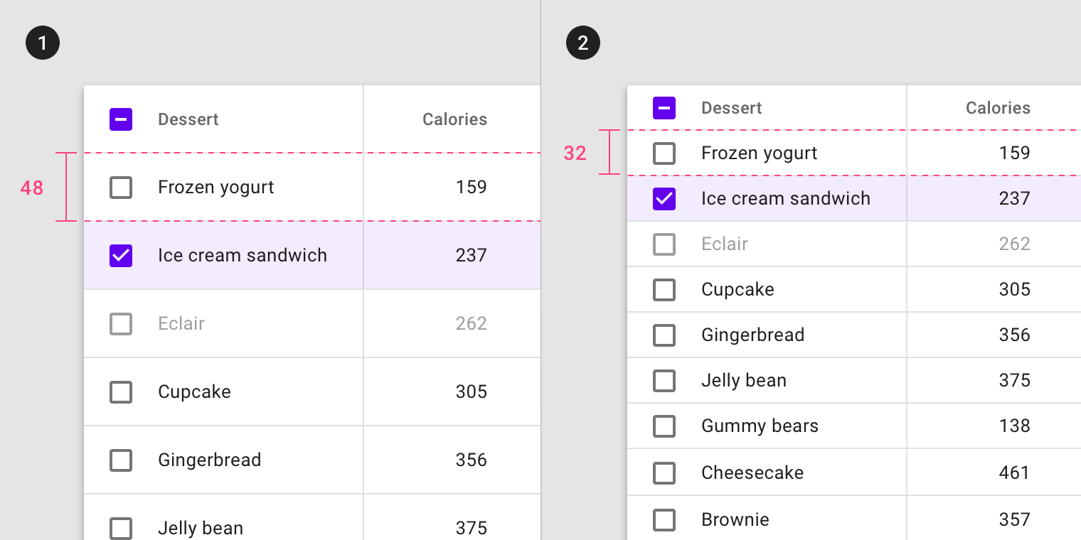
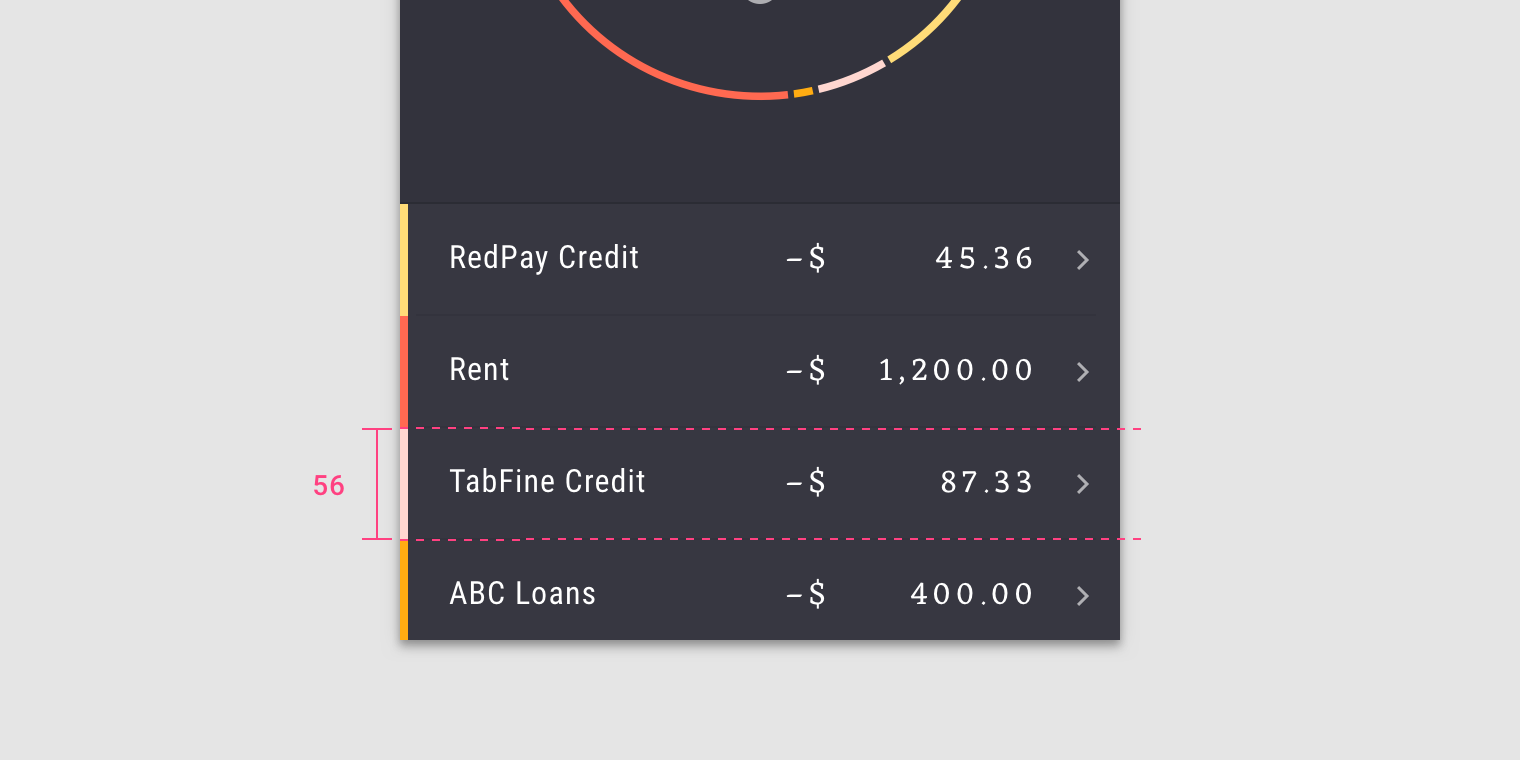
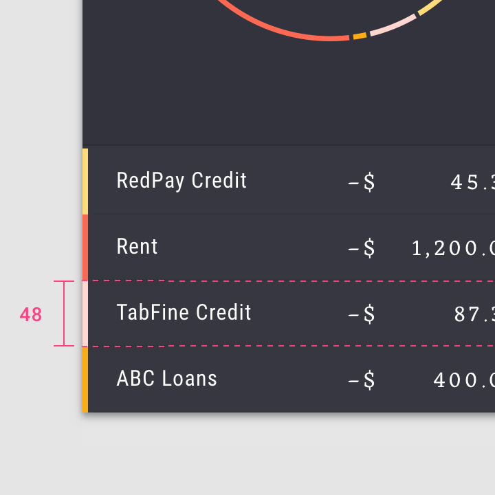
- Default density, 48dp row height
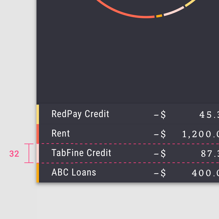
- High density, 32dp row height
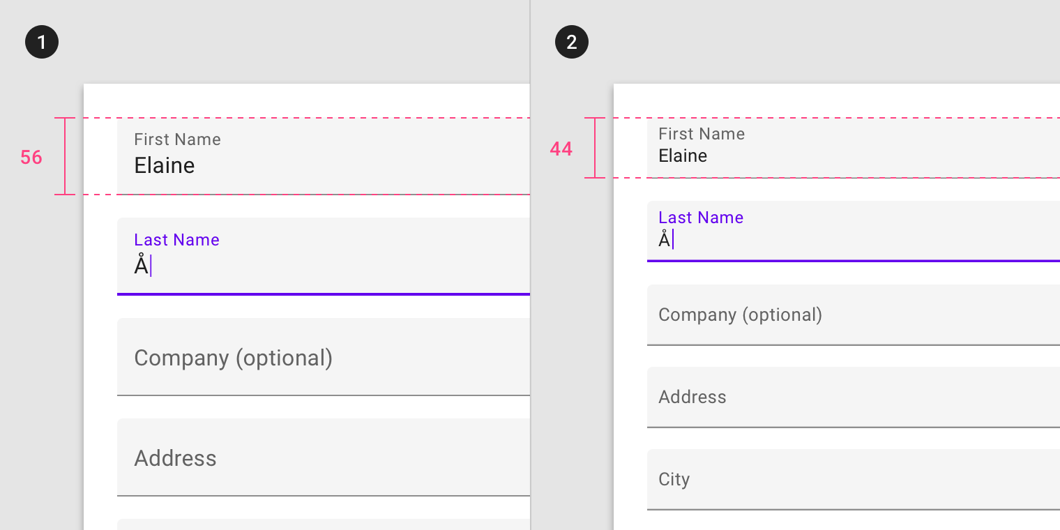
- Default density, 56dp text field height
- High density, 44dp text field height
When not to apply density
密度を適用しない場合
Don’t apply density to components that involve focused tasks, such as interacting with a dropdown menu or picker. Increasing density on these components reduces their...
High density should not be applied to task or alert-based components.
高密度は、タスクまたはアラートベースのコンポーネントには適用しないでください。
Focused tasks
集中されるタスク
Don’t apply density to components that involve focused tasks, such as interacting with a dropdown menu or picker. Increasing density on these components reduces their usability.
ドロップダウンメニューやピッカーの操作など、集中的な作業を伴うコンポーネントでは密度を上げないでください。 これらの部品の密度を上げると、使い勝手が悪くなります。
Don’t.
Don’t apply high density to a date picker, as this reduces usability.
使い勝手が悪くなるので、日付選択に高密度を適用しないでください。
Alerts and messaging
アラートとメッセージ
Don’t apply density to components that alert the user of changes, such as snackbars or dialogs. Applying high density to alerts reduces their ability to command attention.
スナックバーやダイアログなど、変更をユーザーに警告するコンポーネントには密度を適用しないでください。 アラートに高密度を適用すると、警告を出す能力が低下します。
Don’t.
Don’t apply high density to dialogs, which reduces their readability and prominence.
読みやすさや目立ちやすさを低下させるダイアログに高密度を適用しないでください。
Layout
レイアウト
Grid and component density
グリッドと部品密度
To create more scannable groups of content, use a less-dense grid layout with high-density components. The higher the density of components, the larger their margins...
To create more scannable groups of content, use a less-dense grid layout with high-density components. The higher the density of components, the larger their margins and gutter widths should be.
よりスキャンしやすいコンテンツのグループを作成するには、高密度コンポーネントを使用して密度の低いグリッドレイアウトを使用します。 コンポーネントの密度が高いほど、それらのマージンと溝幅は大きくなります。
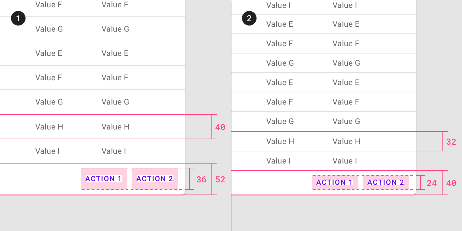
High-density component row height, with wide margins and gutters
広い余白と溝を持つ高密度コンポーネント行の高さ
Default density component row height, with narrow margins and gutters
狭いマージンとガターを使用した、デフォルトの密度コンポーネントの行の高さ
Don’t.
Don’t use both a dense layout grid and dense components, as this will make it difficult to differentiate content groups.
密なレイアウトグリッドと密集したコンポーネントの両方を使用しないでください。コンテンツグループを区別するのが難しくなります。
Touch and click targets
タッチとクリックのターゲット
Touch target specs
タッチ対象スペック
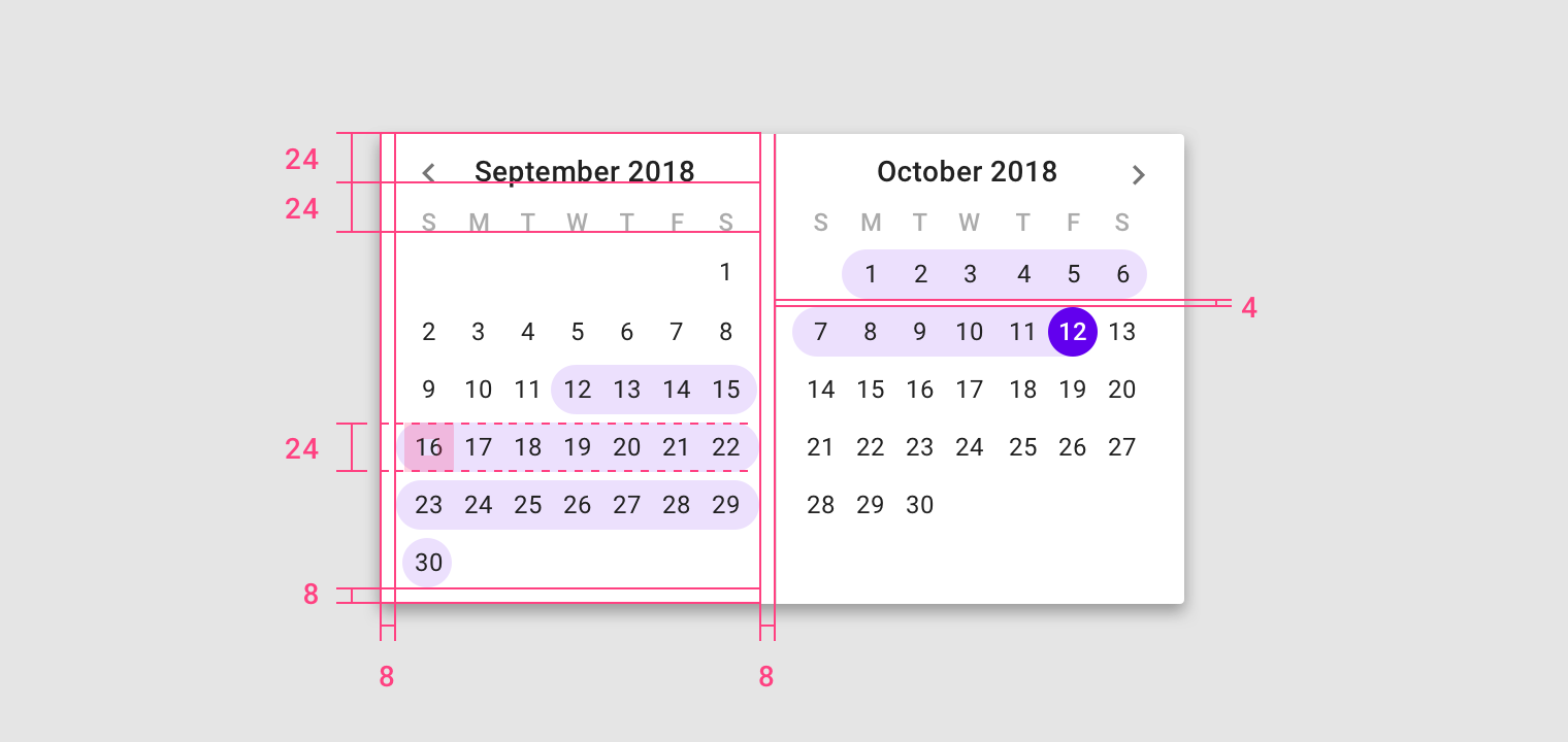
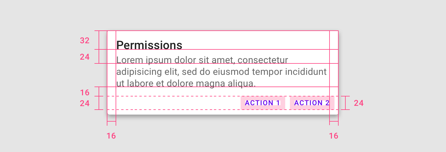
Touch targets apply to any device that receives both touch and non-touch input. To balance information density and usability, touch targets should be at least...
Touch targets apply to any device that receives both touch and non-touch input. To balance information density and usability, touch targets should be at least 48 x 48 dp, with at least 8dp of space between each target.
タッチターゲットは、タッチ入力と非タッチ入力の両方を受信するすべてのデバイスに適用されます。 情報密度と使いやすさのバランスをとるために、タッチターゲットは少なくとも48 x 48 dp、各ターゲット間に少なくとも8 dpの間隔を空けてください。

Touch target minimum of 48 x 48 dp
There are some edge cases when touch target sizes must be smaller than the recommended minimum 48dp.
タッチターゲットのサイズが推奨される最小48dpよりも小さくなければならない場合があります。

- Smaller touch targets for links within a paragraph.
段落内のリンクに対する小さなタッチターゲット。 - Smaller touch targets for a date selection in picker.
ピッカーでの日付選択のタッチターゲットが小さくなりました。
Applying density
密度に合わせる
Default density in a list
リスト内のデフォルト密度
Do.
In this high-density list, the minimum space (48px) is defined by the tap target on each list item.
この高密度リストでは、最小スペース(48px)は各リストアイテムのタップターゲットによって定義されます。
Click targets
On non-touch UIs, click targets should be at least 24 x 24 dp, with at least 8dp of space between each target.
On non-touch UIs, click targets should be at least 24 x 24 dp, with at least 8dp of space between each target.
非タッチUIでは、クリックターゲットは少なくとも24 x 24 dp、各ターゲット間に少なくとも8 dpのスペースが必要です。
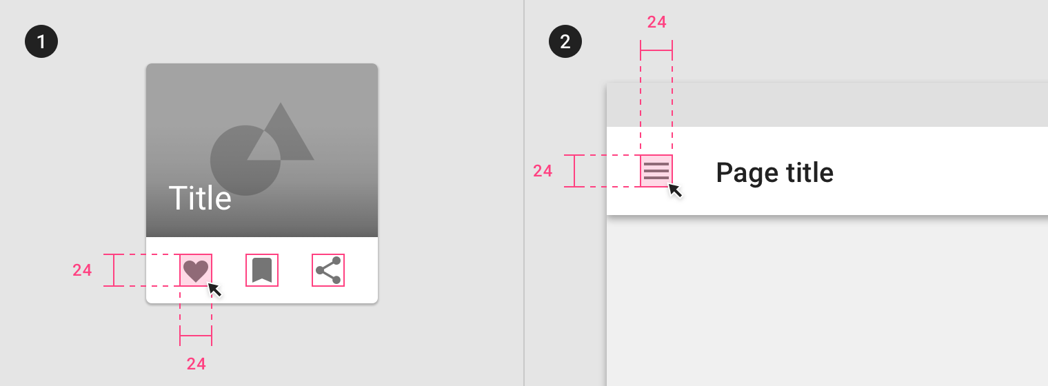
Click target minimum 24 x 24dp
Applying Density
密度に合わせる
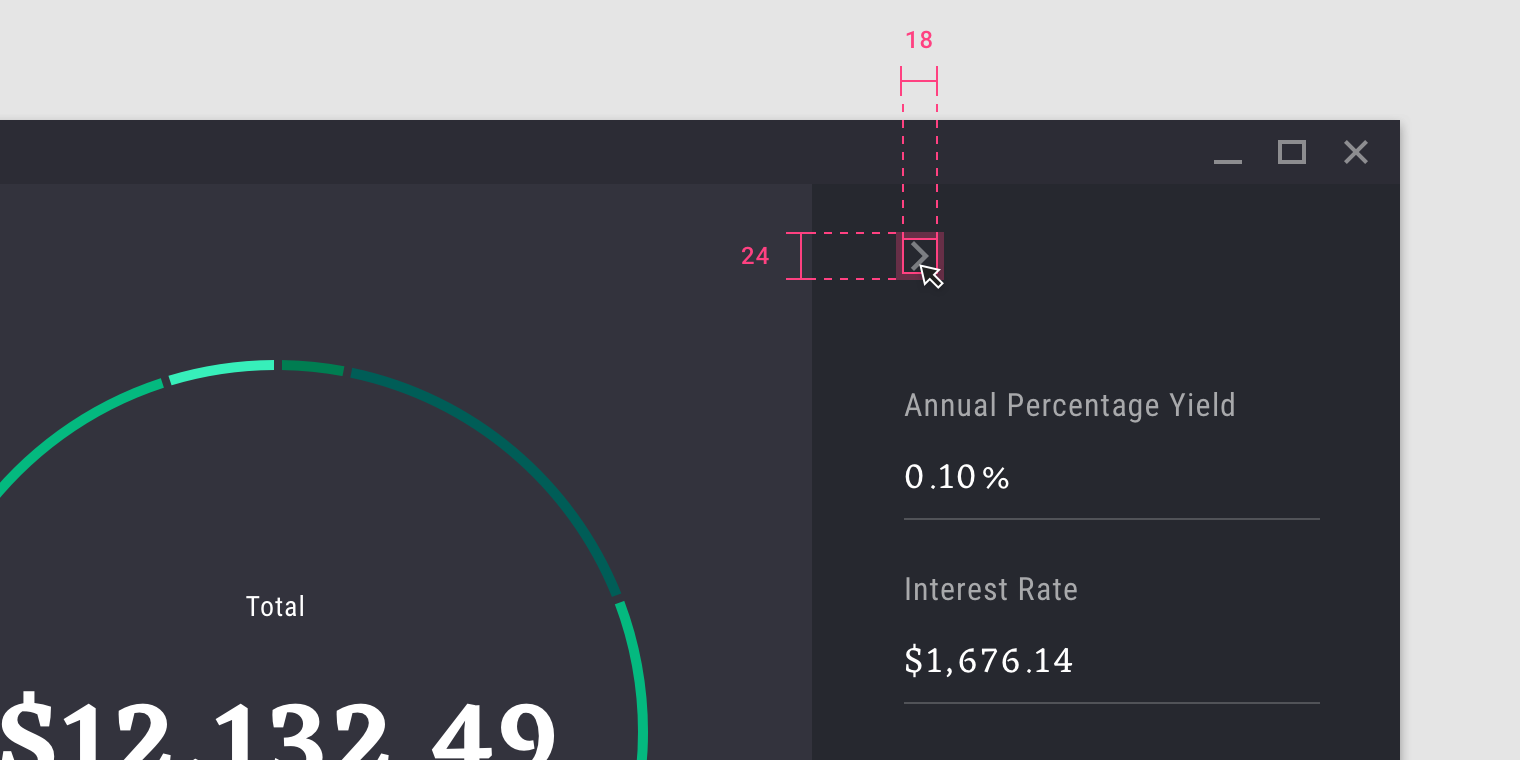
When using high-density icons (18dp), the minimum space (24px) is defined by the click target.
高密度アイコン(18dp)を使用する場合、最小スペース(24px)はクリックターゲットによって定義されます。
Typographic density
活字密度
Line height
ラインハイト
Line height is the space between lines of text. Line height can be used as a way to create density in typographic layouts. When tightening...
Line height is the space between lines of text. Line height can be used as a way to create density in typographic layouts. When tightening line height be sure to still use the 4dp baseline grid.
行の高さはテキストの行間のスペースです。 行の高さは、活版印刷レイアウトで密度を作成する方法として使用できます。 ラインの高さを引き締めるときは、必ず4dpベースライングリッドを使用してください。
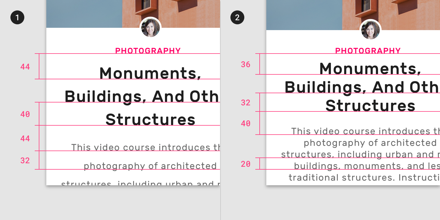
- Larger line height
- Smaller line height